Wedding Booklet Covers

We’ve worked on quite a few fun custom projects lately, and this booklet cover for St. Andrew’s Church was on of those projects.
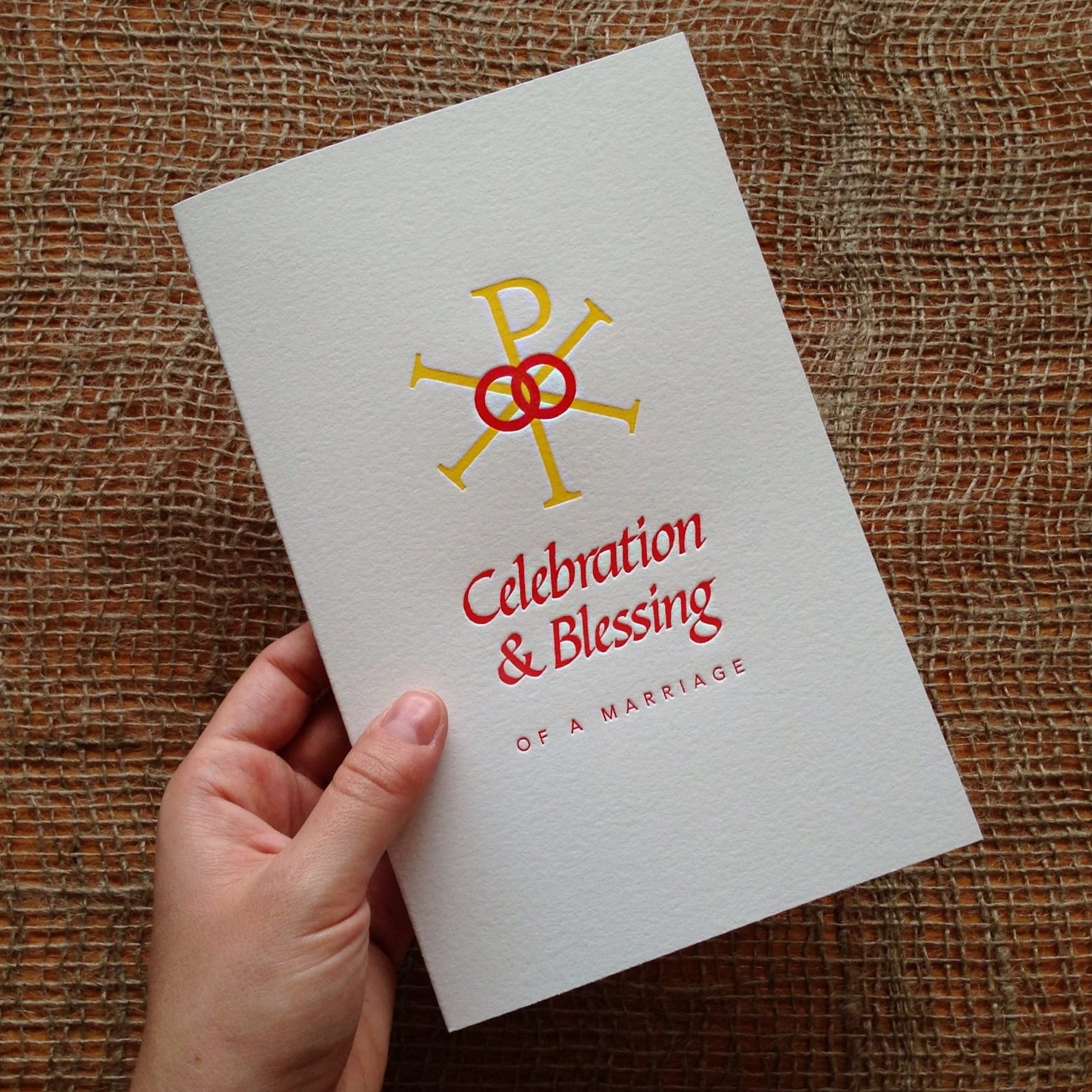
Greg, the Communications Director at St. Andrew’s, contacted us after seeing our cards on Fab.com earlier this year, and Andrew Barton of Andrew Barton Design did the graphic design work. It was really nice to talk with them at the start of the design process– we were able to discuss the constraints of letterpress printing and what designs work best for our press.

Printed on 110-lb cotton paper, this two-color print will be the cover to the wedding booklet that couples will receive when they get married at the church (what an amazing keepsake from a special day).
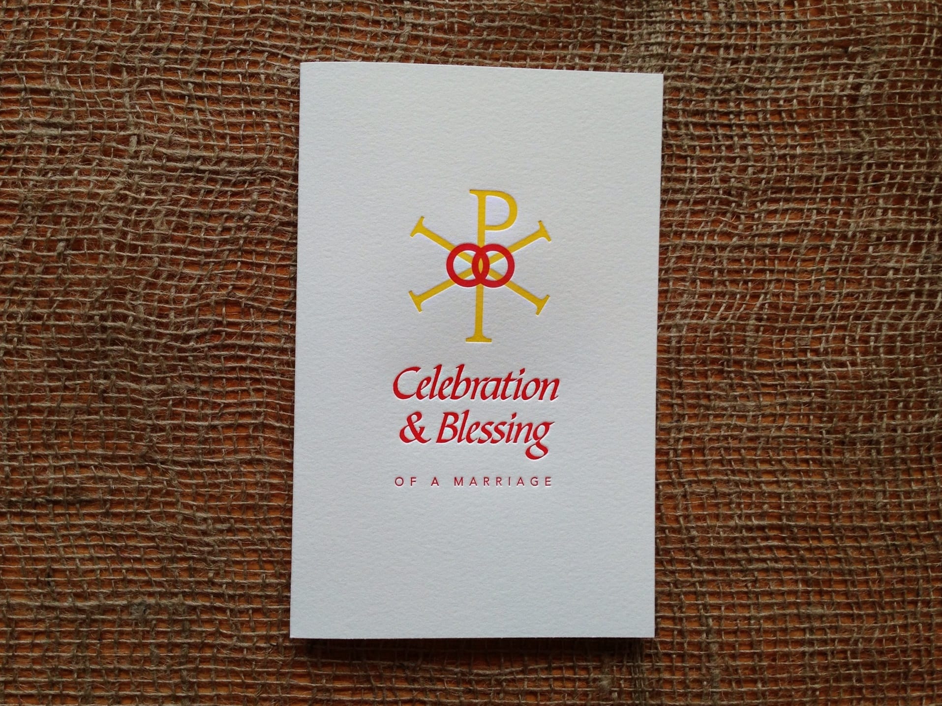
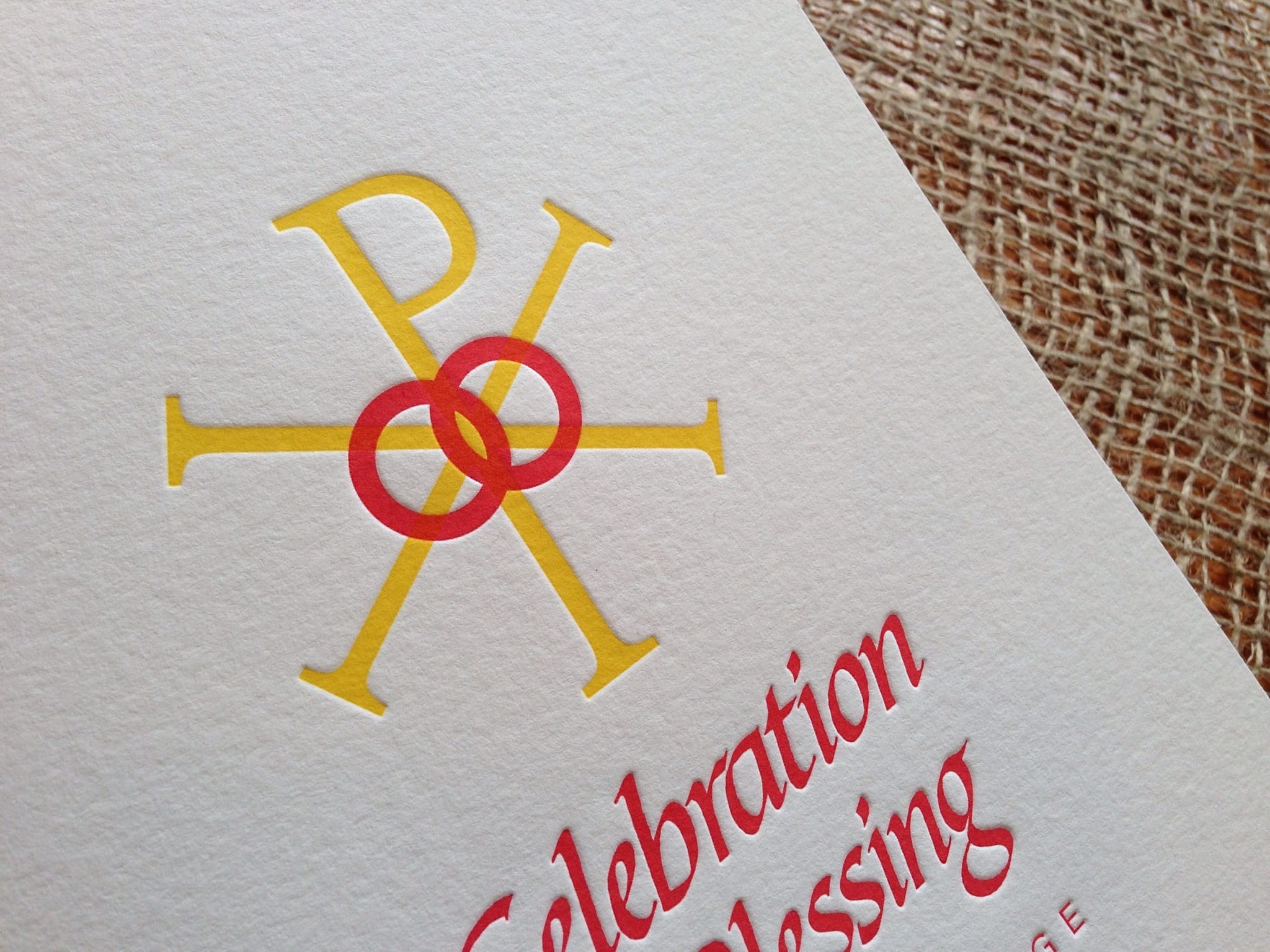
 

We really enjoyed working with Greg and Andrew and also loved having them stop by the studio to see the press in action.
Folk Fibers Business Cards

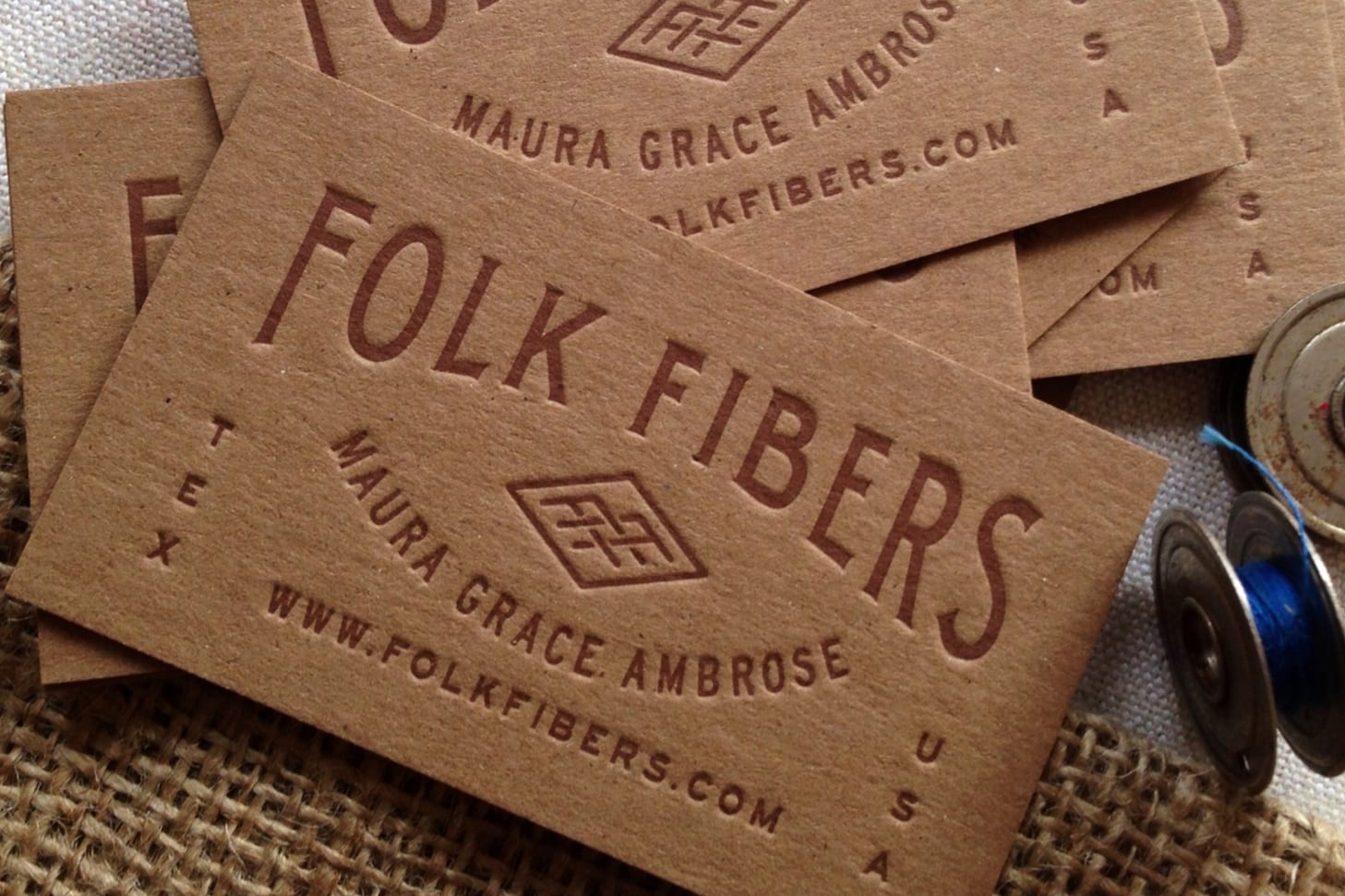
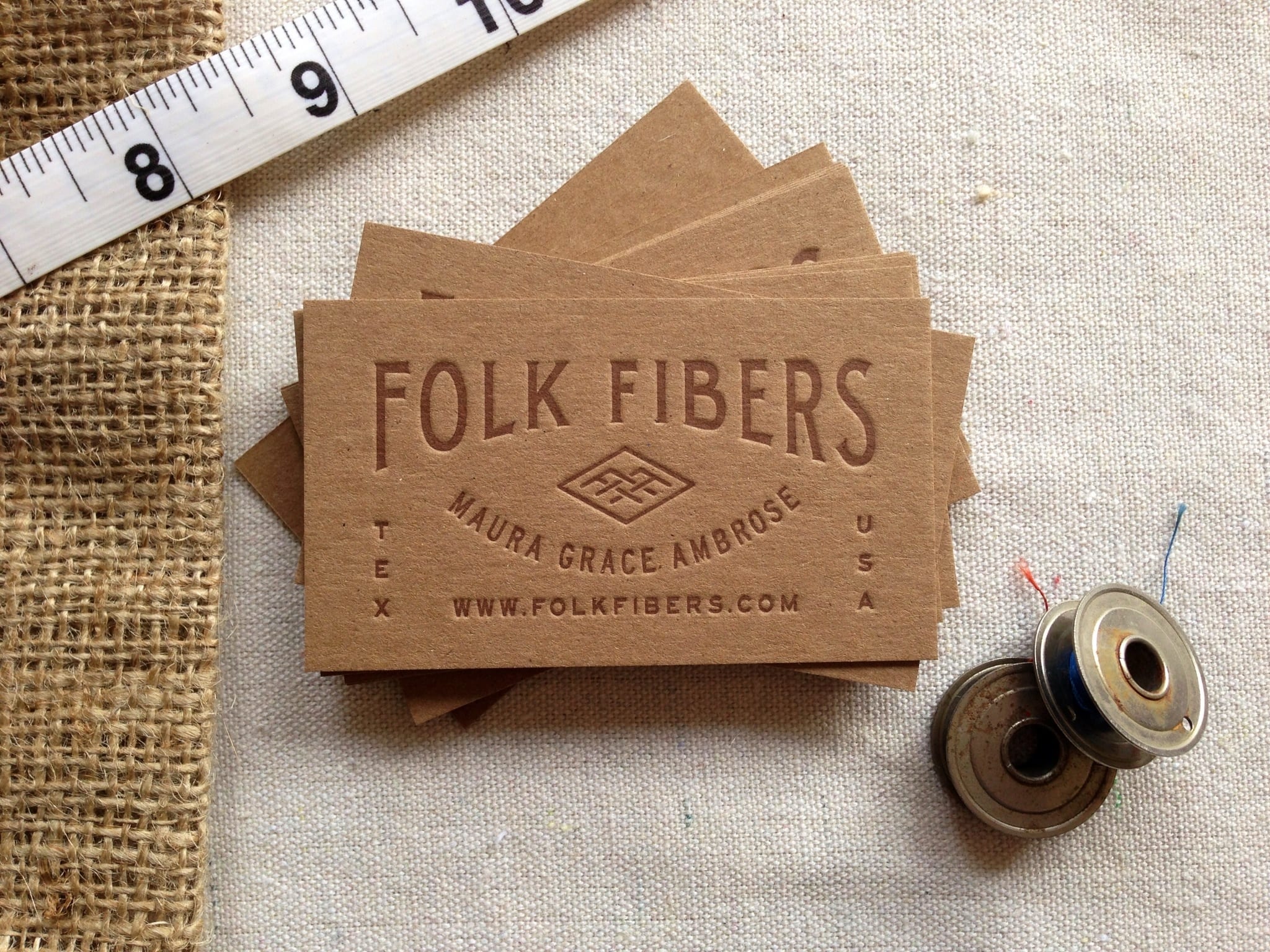
Our friend Maura Ambrose is the talented quilter and textiles artist behind Folk Fibers. She makes beautiful quilts from fabrics dyed by hand with natural dyes (including indigo that she harvests from her backyard). Each piece is an absolute work of art.
 

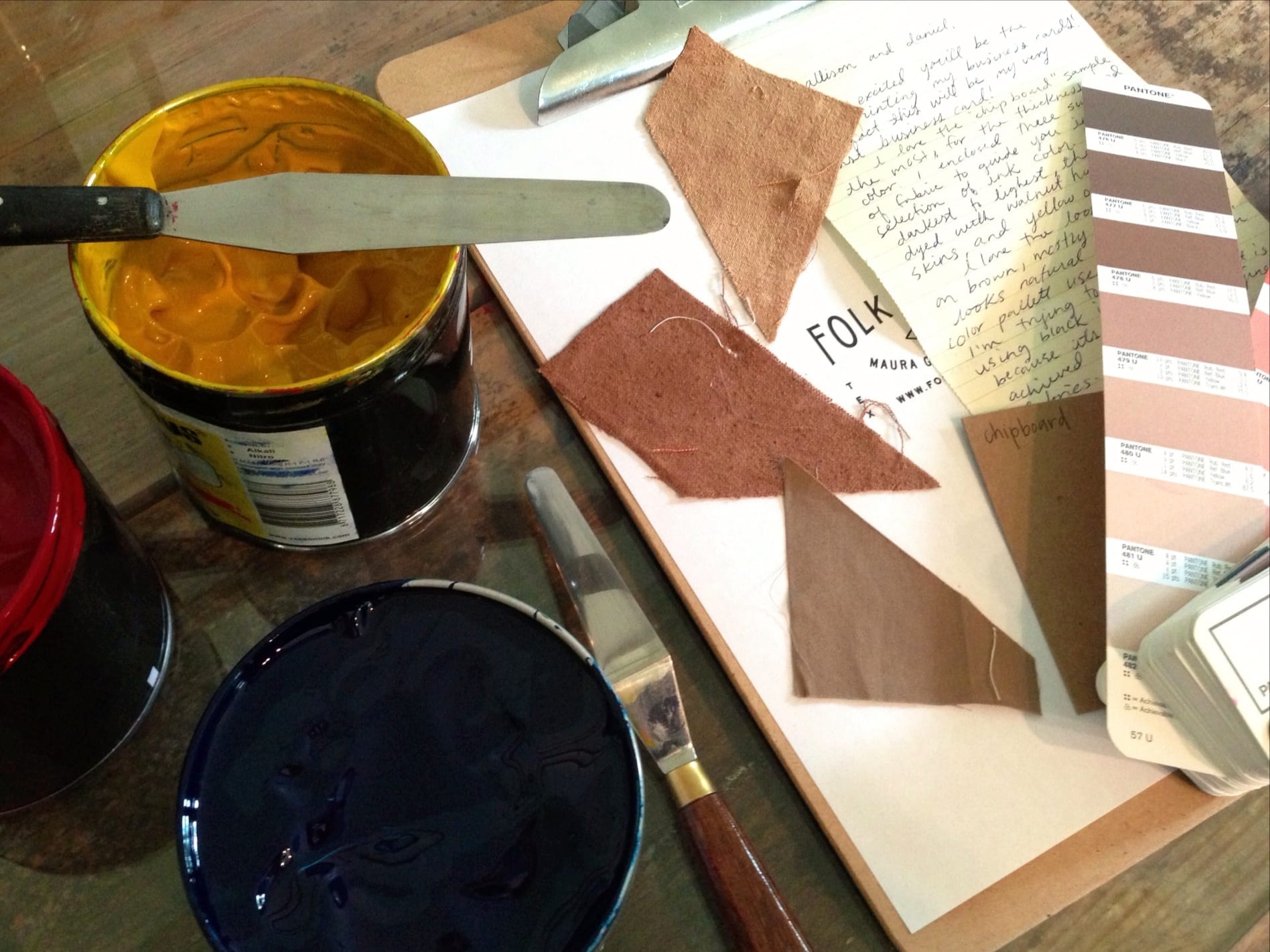
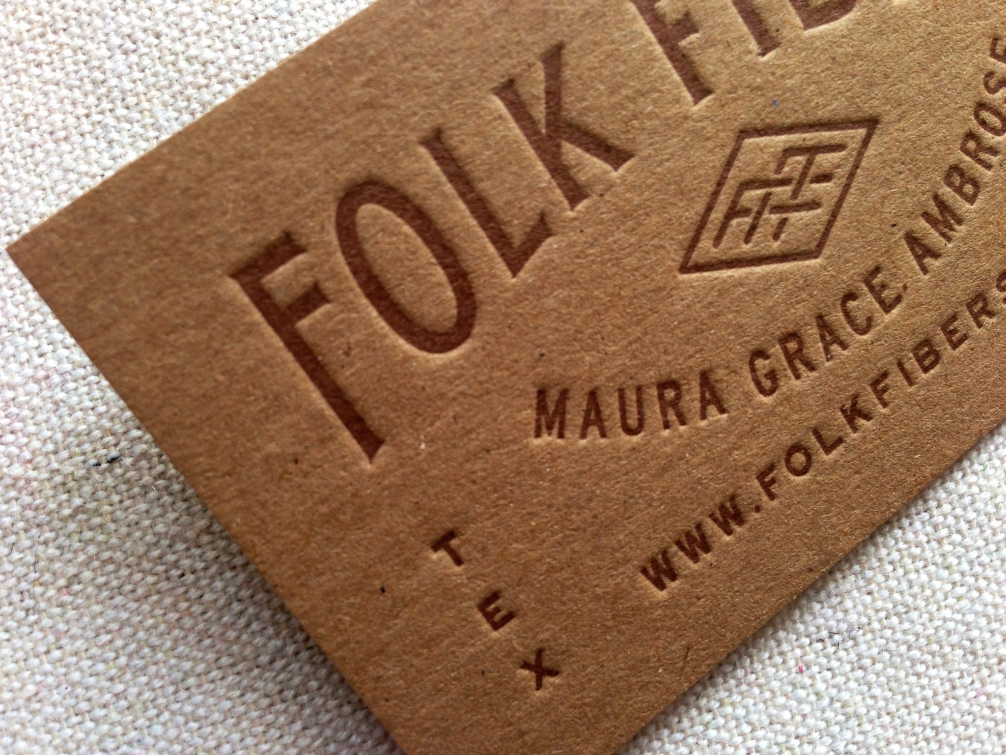
We were so excited when Maura asked us to print her business cards. It was such a fun project to work on, and I love that handwritten correspondence was part of the process as we mailed paper and fabric samples to one another.

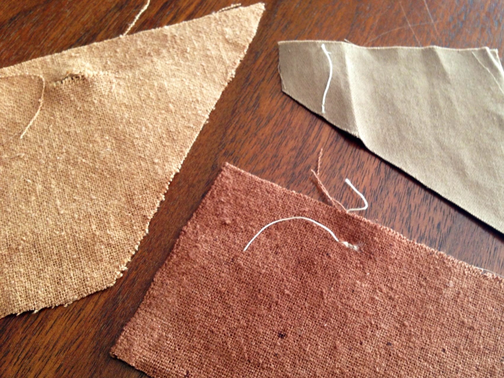
Maura chose a thick, recycled chipboard for her paper stock and sent us samples of her naturally dyed fabrics for ink color inspiration– she wanted her business cards to reflect the colors of the natural dyes she uses in her quilts. The samples below were dyed with yellow onion skins, red onion skins, and walnut hulls. From there, we were able to pick a color (478) from our Pantone guide.

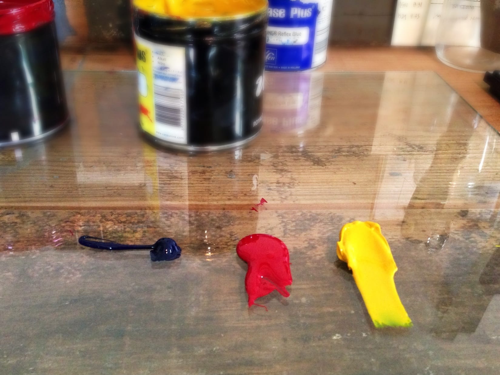
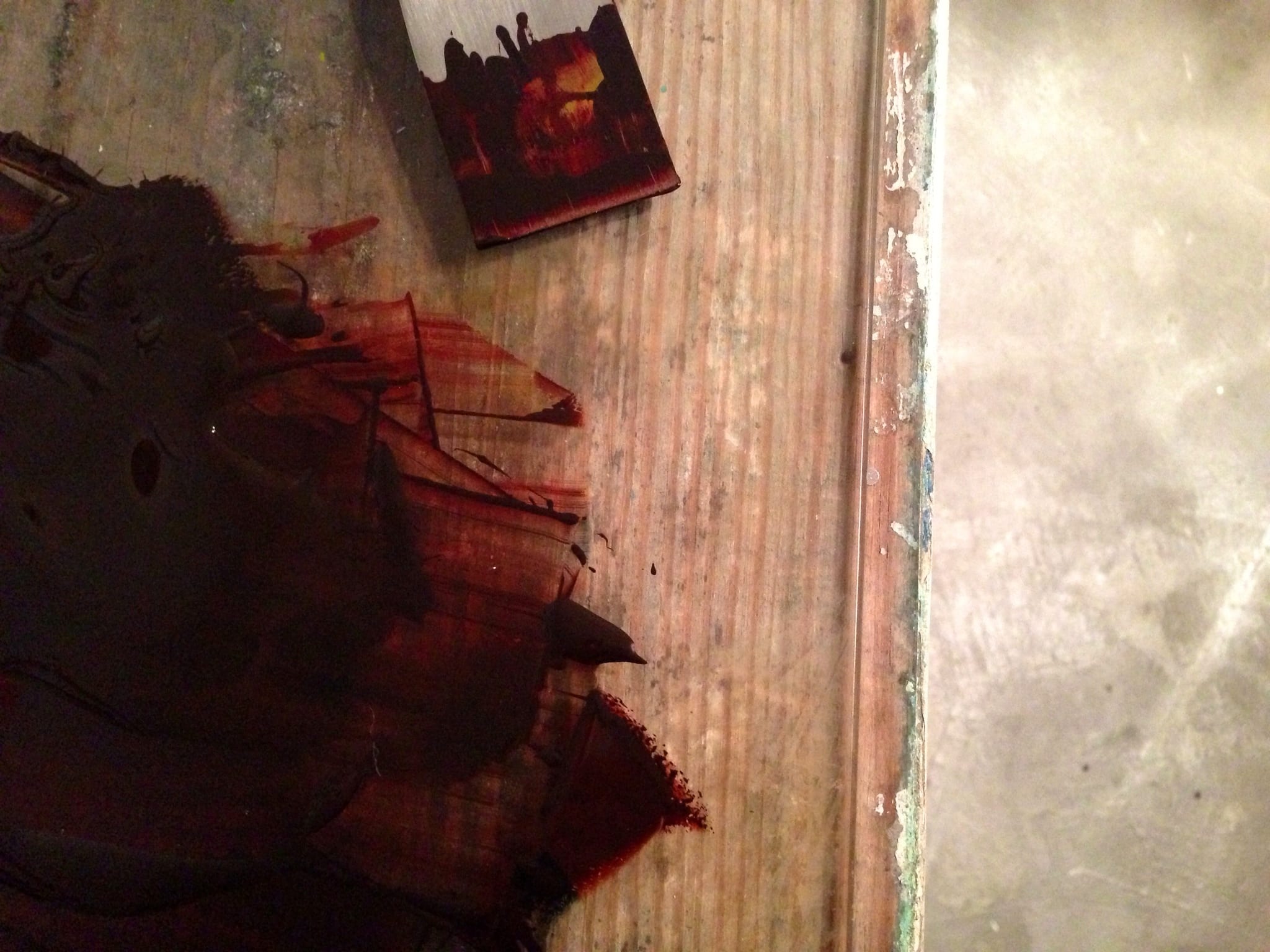
Mixing the ink is one of my favorite parts of the process– it’s so hands on, and I love watching the new color appear.

Below are a few behind-the-scenes photos of the letterpress printing process.

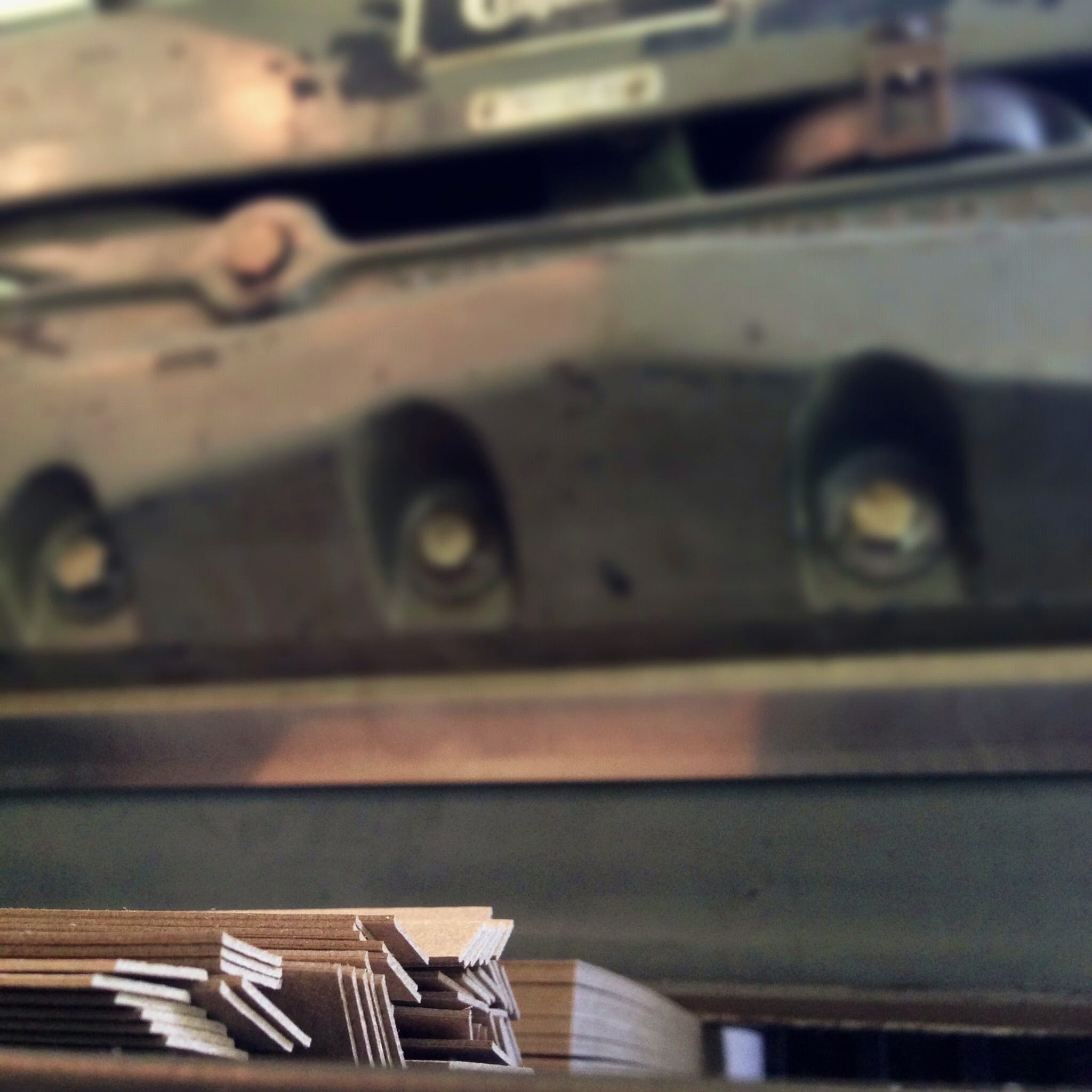
Paper cutter in action

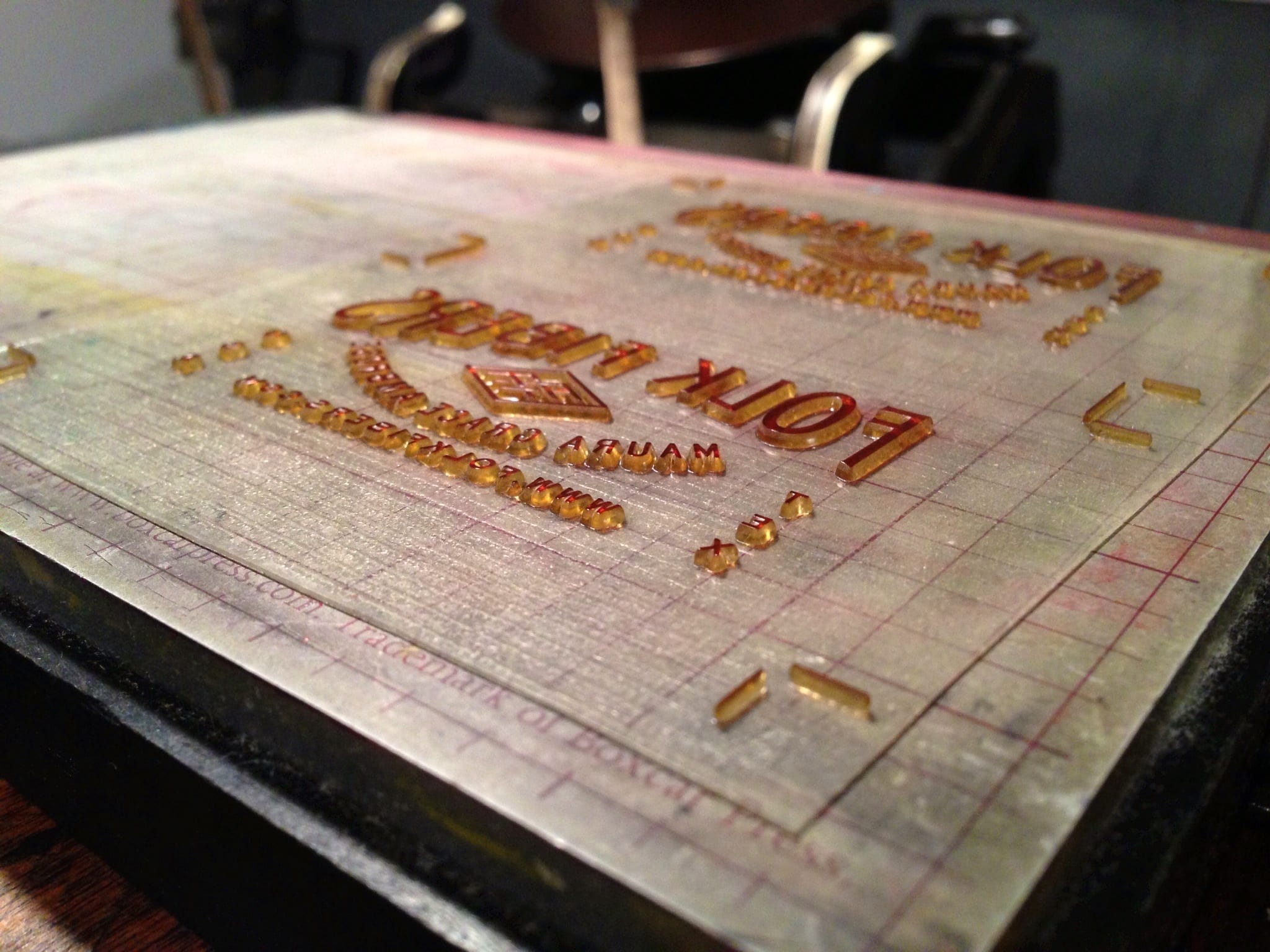
Photopolymer plate inked and ready for printing

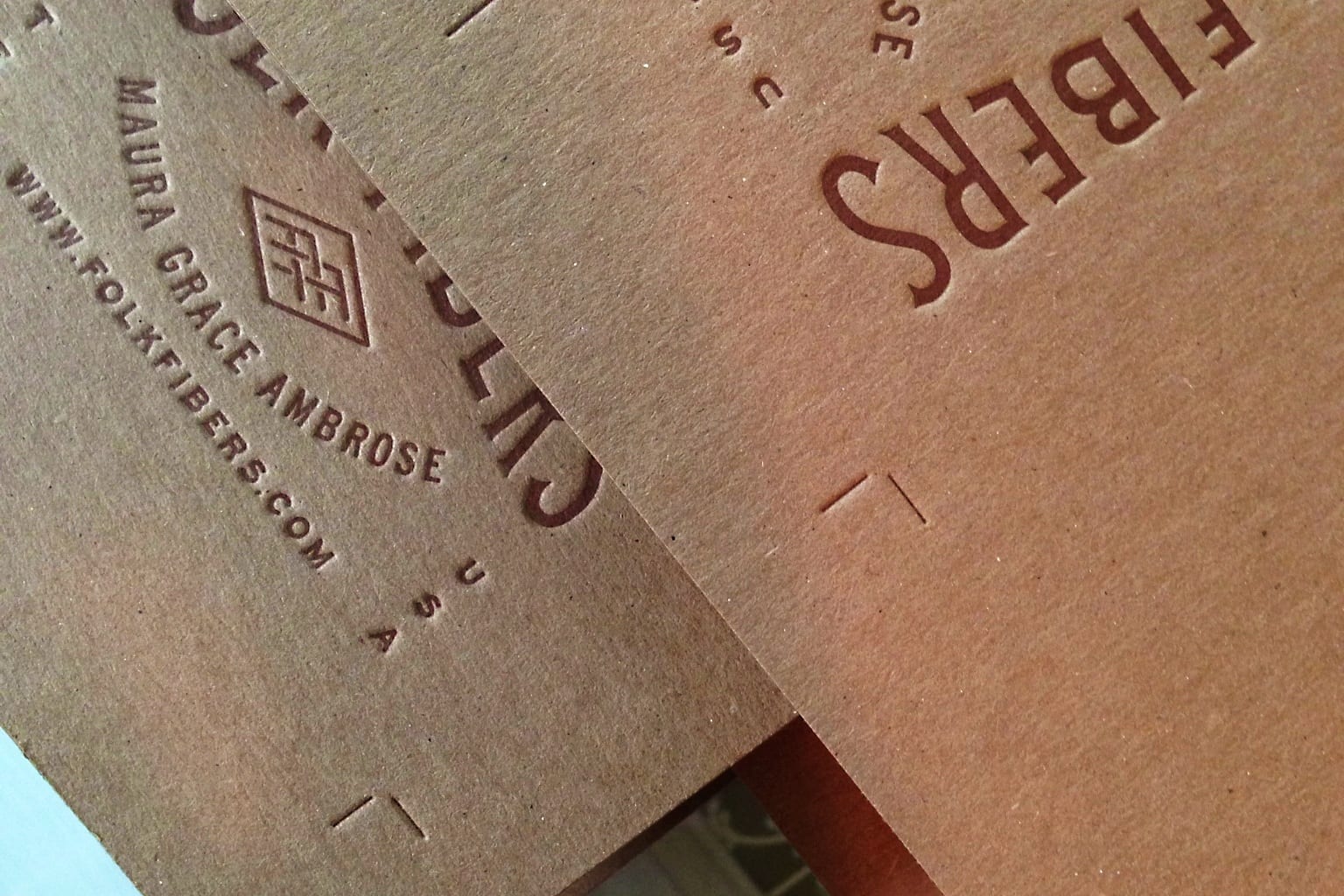
Freshly printed business cards, stacked and ready for the final trim

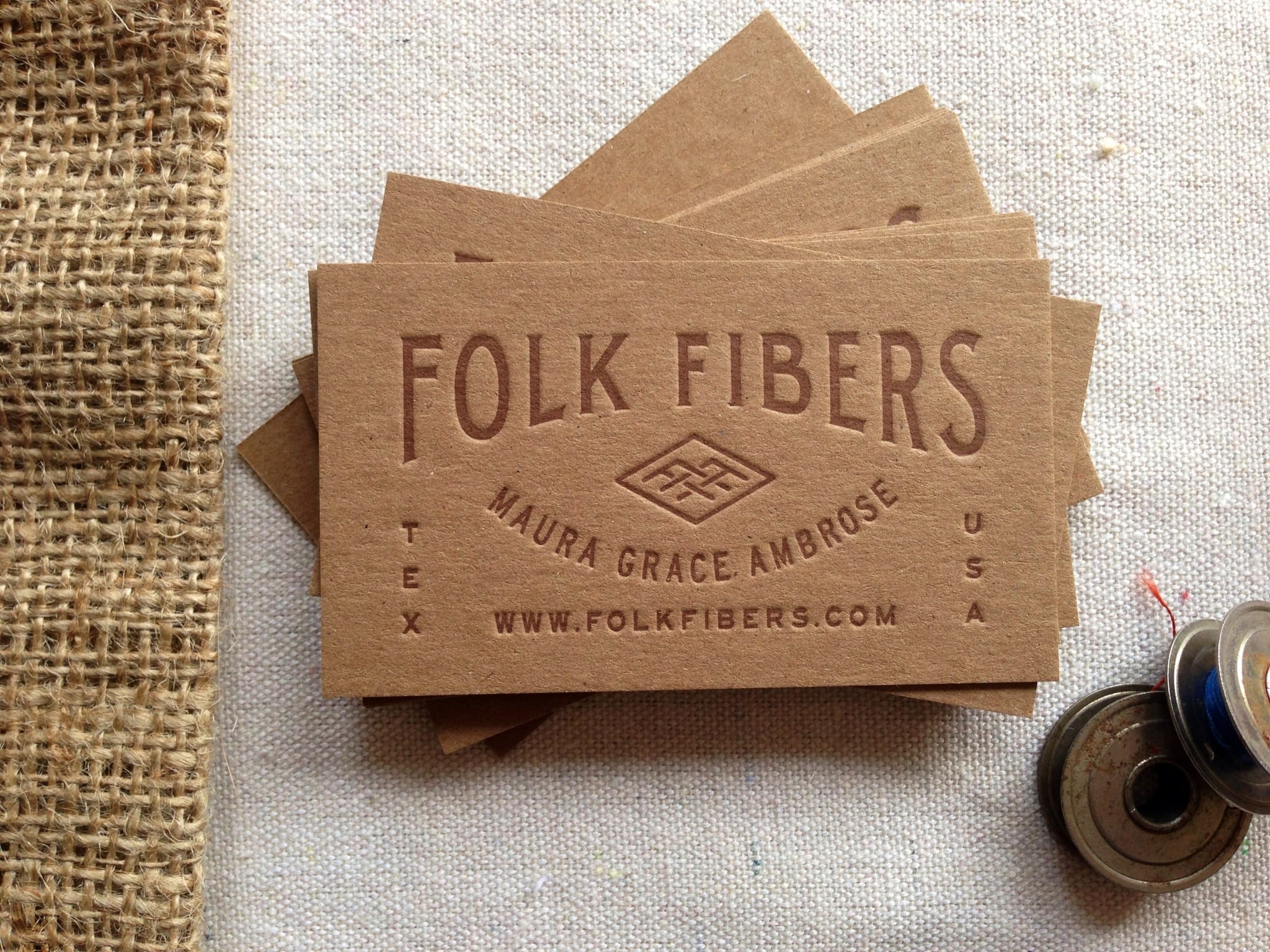
Finished product


UPDATE 10/22/2012:

In case you were wondering who did the amazing logo and business card design for Folk Fibers: Ryan Rhodes of LAND.


Vacord Business Stationery

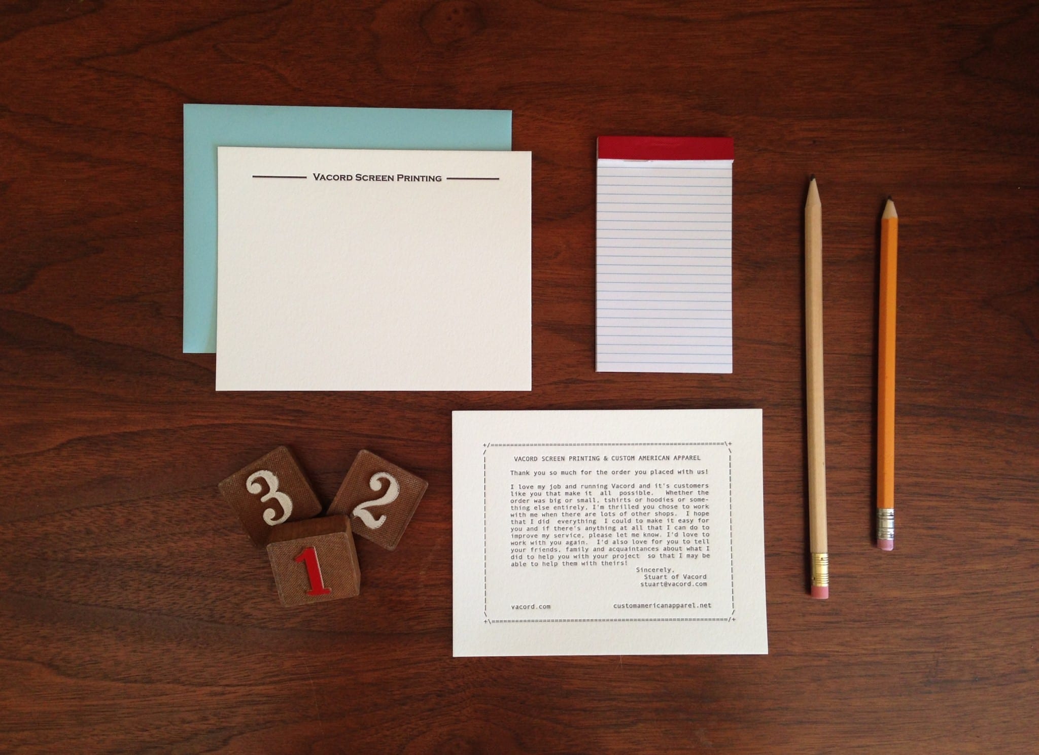
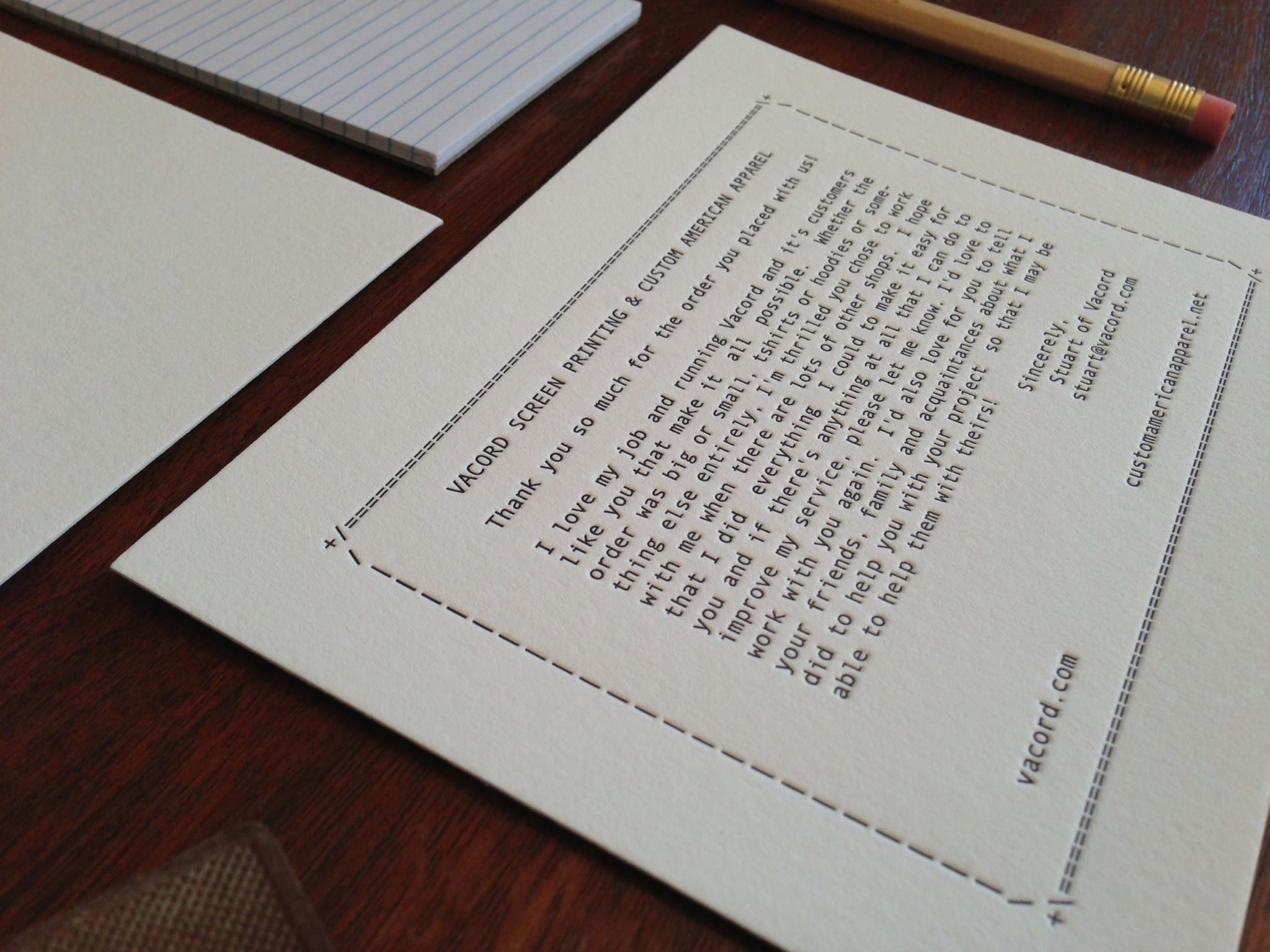
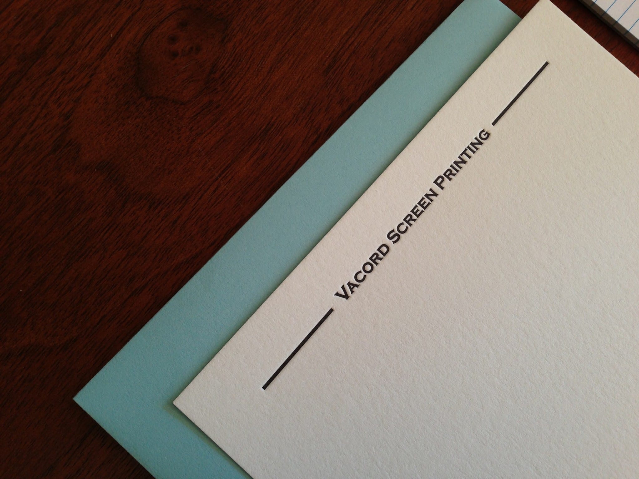
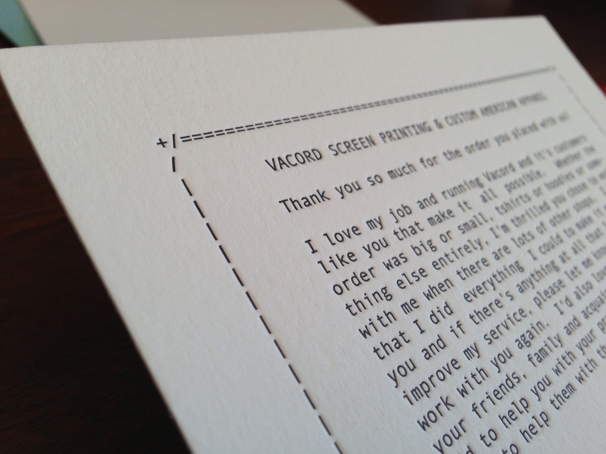
Our good friend Stuart, recent Park Circle resident and owner of Vacord Screen Printing, came to us for custom letterpress printing for his business stationery.

We printed two, A2-sized pieces in black ink– one for handwritten correspondence (paired with a blue envelope) and one thank-you enclosure to be included with all of his orders.

While simple, they make a big impact, and we’re pretty sure his customers will notice.

Pecha Kucha 15

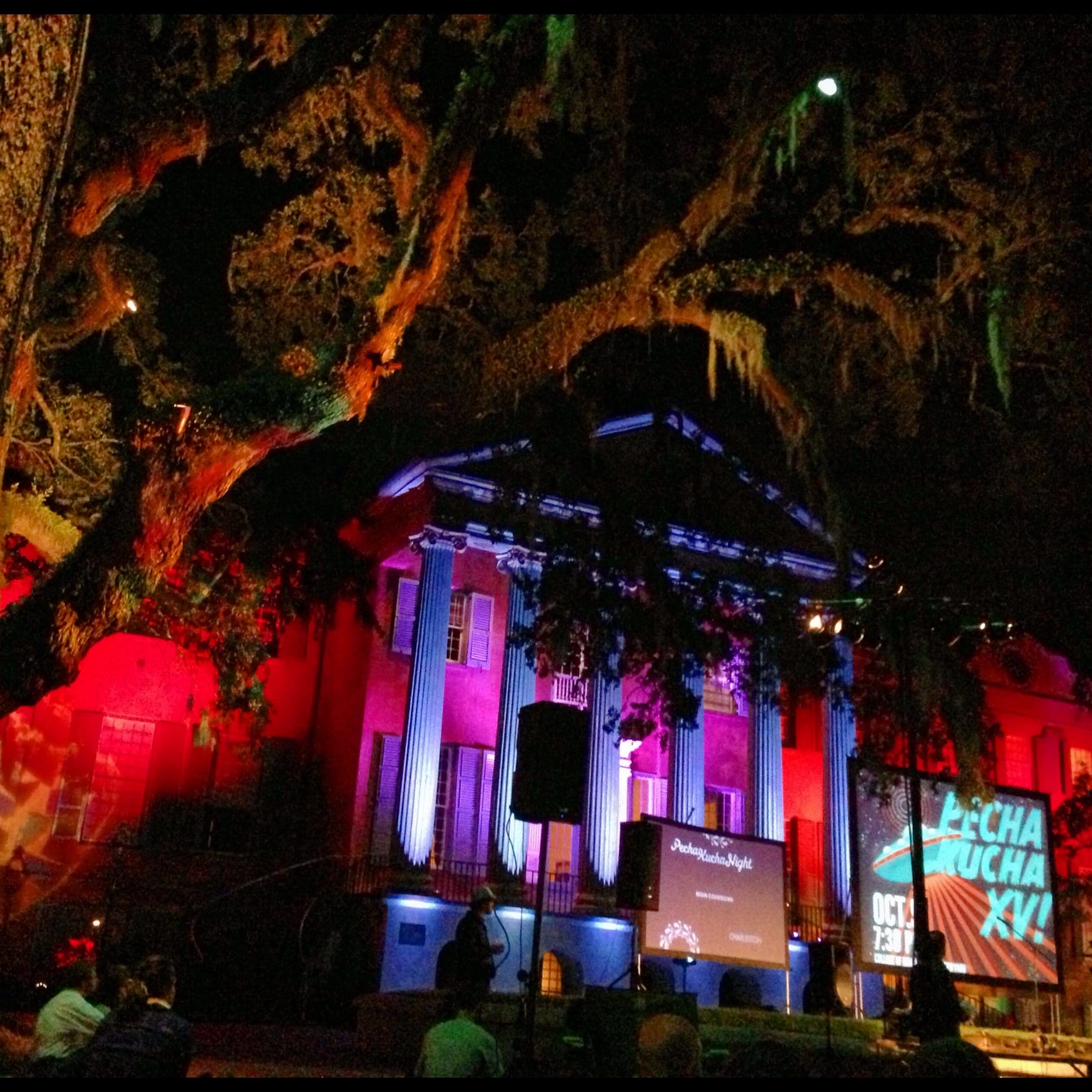
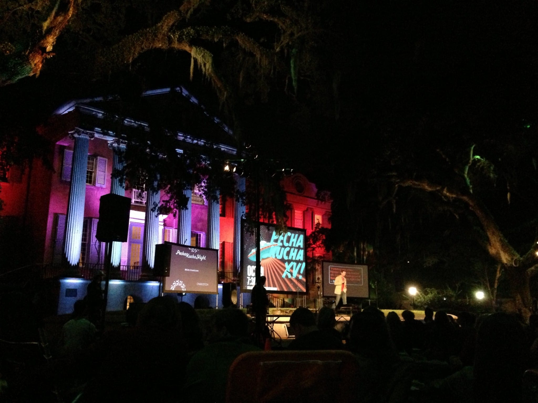
This past Tuesday we were nestled beneath enormous oak trees draped in Spanish moss at the College of Charleston’s Cistern Yard for Pecha Kucha 15. (A quick explanation of Pecha Kucha: it’s Japanese for the sound of conversation. It’s a “mix of show-and-tell, open-mike night and happy hour that has become a forum for ideas on design, architecture and other forms of creativity.” Presenters have 6 minutes and 40 seconds to discuss 20 slides.)

Jamie and I have been to past Pecha Kucha nights and always leave feeling inspired. Being self-employed, it’s easy to get stuck behind the computer or feel the need to be working ALL of the time. The creative community in Charleston is talented, encouraging, and growing. Pecha Kucha 15 definitely did not disappoint (check out the full list of presenters here). The definite theme was importance of the story… whether that’s highlighting the “slow-fashion” movement by investing in quality over trends, learning exactly what goes in to the product sitting on your nightstand, or supporting physical publications.

Miss getting tickets? (They always sell out in record time.) There’s a great recap video here too.

Now, go do something creative this weekend.

Harvest Moon Wedding Invitations

Emily and Ken got married in an outdoor wedding on the evening of the Harvest Moon (which is the full moon closest to the autumnal equinox). As summertime rolls into autumn, they began their new lives together under the brightness of the moonlight (so romantic!).
Neutral colors and natural materials set the stage for the outdoor wedding. Printed on cotton paper, the assembled set was tied with hemp twine and tucked into a recycled kraft envelope.

Text that looks as though it was hand-lettered suggests a casual, but intimate, event.

One of my favorite parts of the reply postcard includes a BMX biker jumping the moon, a small nod to one of Ken’s favorite activities.

And, of course, we LOVE that Emily and Ken wanted guests to include handwritten notes of advice and well wishes. Including the card with the invitation set makes it easy for people to provide a thoughtful response (rather than trying to get people to come up with sometime at the wedding).

We had so much fun working on these invitations. Cheers to your new life together, Emily and Ken!