Blog, Event, Ink Meets Paper
Event Display Makeover
Over the past year or so, we’ve become more comfortable with the routine that comes with preparing for a craft show: how much inventory to bring, how much cash we’ll need to make change, how long our display setup will take, how to package up everything in the fewest (and lightest weight) containers. That said, we still feel there’s always room for improvement and more polish. After each show, we discuss and critique– what works, what doesn’t work, what needs to be changed, etc).
For all of our previous shows, we set up a table with a burlap cloth and then arranged the cards in stacks or in crates and boxes. While it looked okay, we felt we could do better.
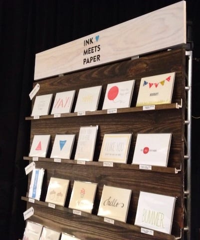
We also wanted customers to have a similar experience at our booth/table that they would in a stationery shop, which meant they’d be viewing them on shelves rather than in stacks on a table. Browsing for cards can be somewhat intimate– you’re looking for the perfect sentiment for someone special and don’t necessarily want that person behind the table staring at your every reaction as you browse through cards.
Jamie built a portable shelf system as our new display. A support panel on the back stabilizes the entire piece (the panel is also hinged to make it easy to transport). It also has a carrying handle. While it is a bit on the heavy side, one person can carry it, and it’s sturdy enough for outdoor use (no worries about gusts of wind). We tried out our new vertical display shelf for the first time at the Lowcountry Artist Market, and I think it worked extremely well.
Singles are displayed along the shelves, and sets are stacked on the table. We keep the extra inventory on the table behind the unit (which we can easily reach when someone makes a purchase).
Aside from visually presenting our cards, the other big piece that we want to communicate is our Card Stories. For the Lowcountry Artist Market, we included the card name and Story Code number (yes, typed on the typewriter) on each shelf below the card.
A separate display to the side of the shelf included vintage cameras, a standup explaining card stories, and an iPhone that looped video footage and demoed the mobile app.
We’ve still got a bit of work to do to prepare for the upcoming series of Maker’s Markets at Mixson since they’re all outside. The screen is difficult to see in bright sunlight, so we’re working on a solution. We’re also planning on including additional signage about the letterpress process and Card Stories.


