Category Archives: Custom

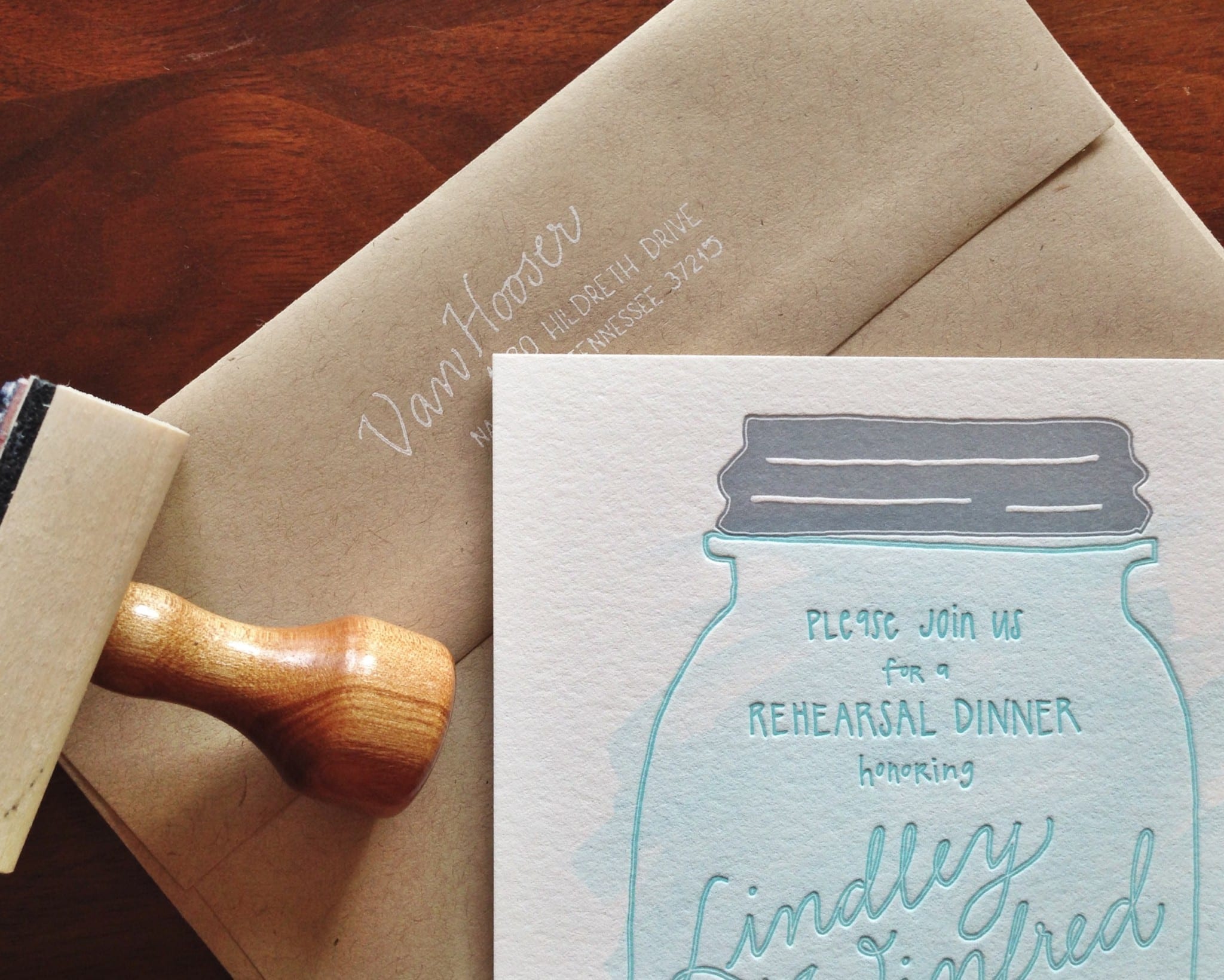
Watercolor Mason Jar Rehearsal Dinner Invitations

Lindley and Winfred had their rehearsal dinner at the Mercantile Deli, a charming restaurant in downtown Franklin, Tennessee that’s known for its delicious southern fare and tables decorated with fresh flowers in blue mason jars.
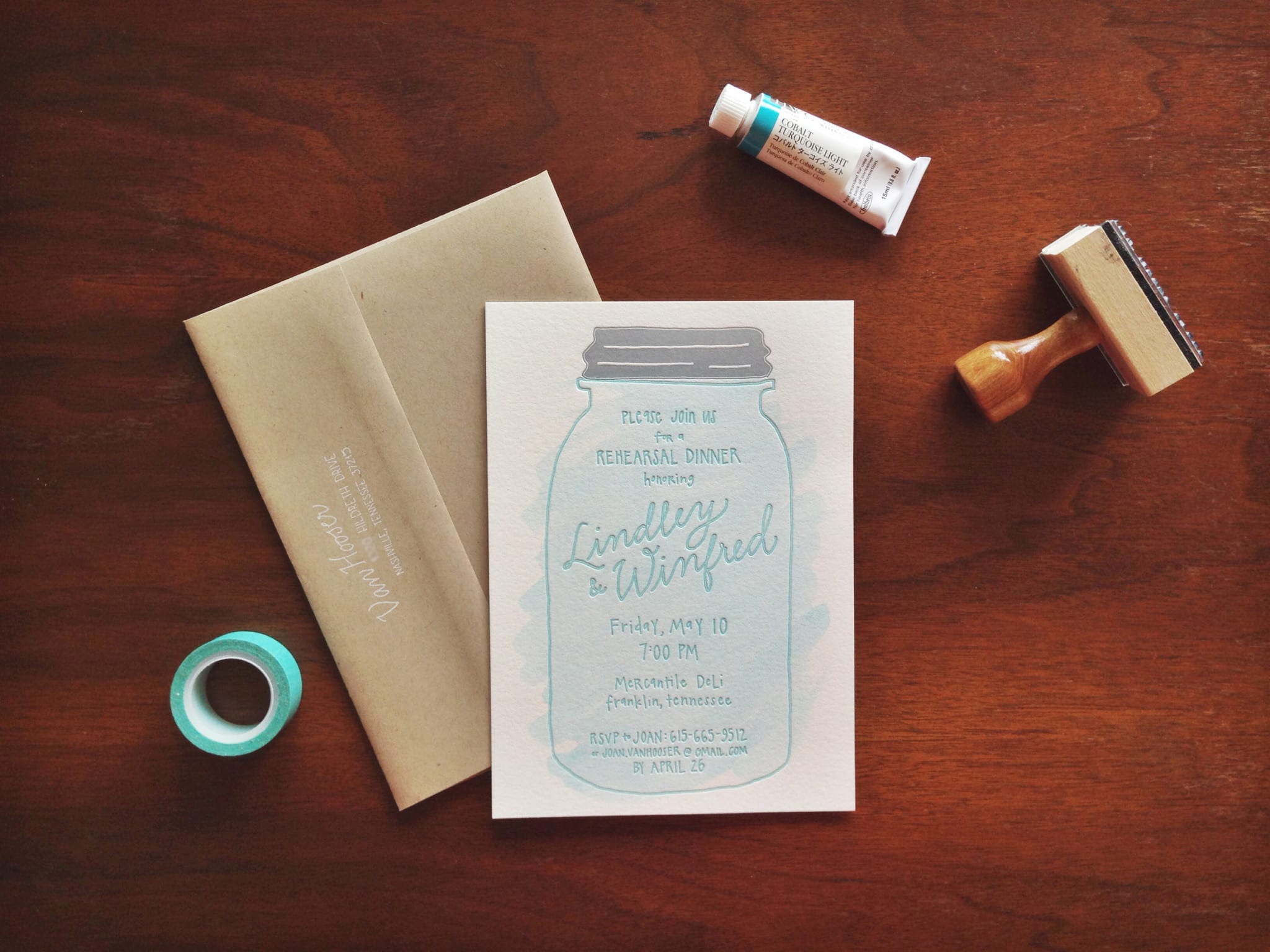
 

For the invitation design, we wanted a hand-drawn piece that connected to the restaurant’s decor and would immediately let guests know the dinner’s atmosphere would be casual and relaxed. All of the text is hand-lettered, and the couple’s names act as the jar’s brand/label.
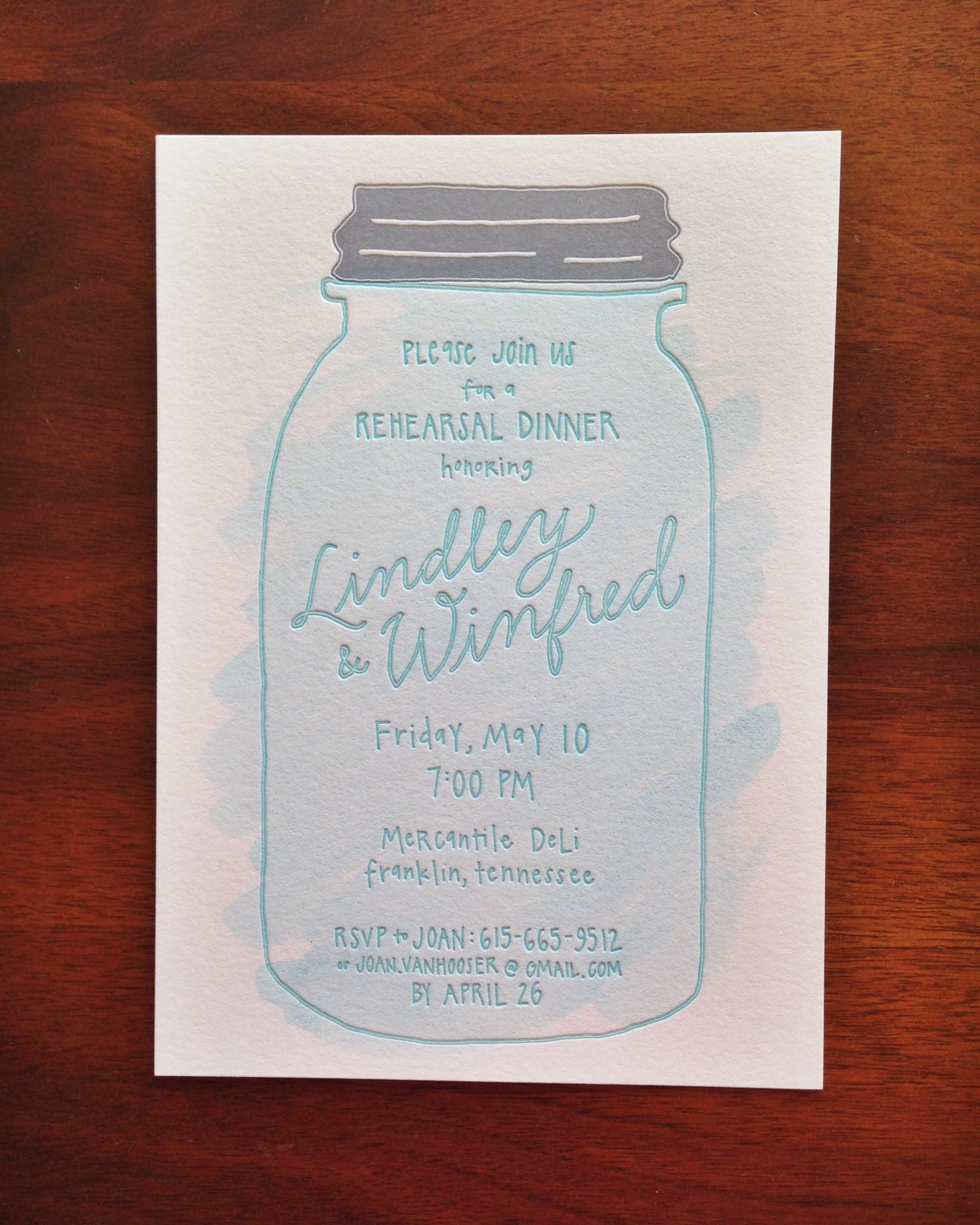
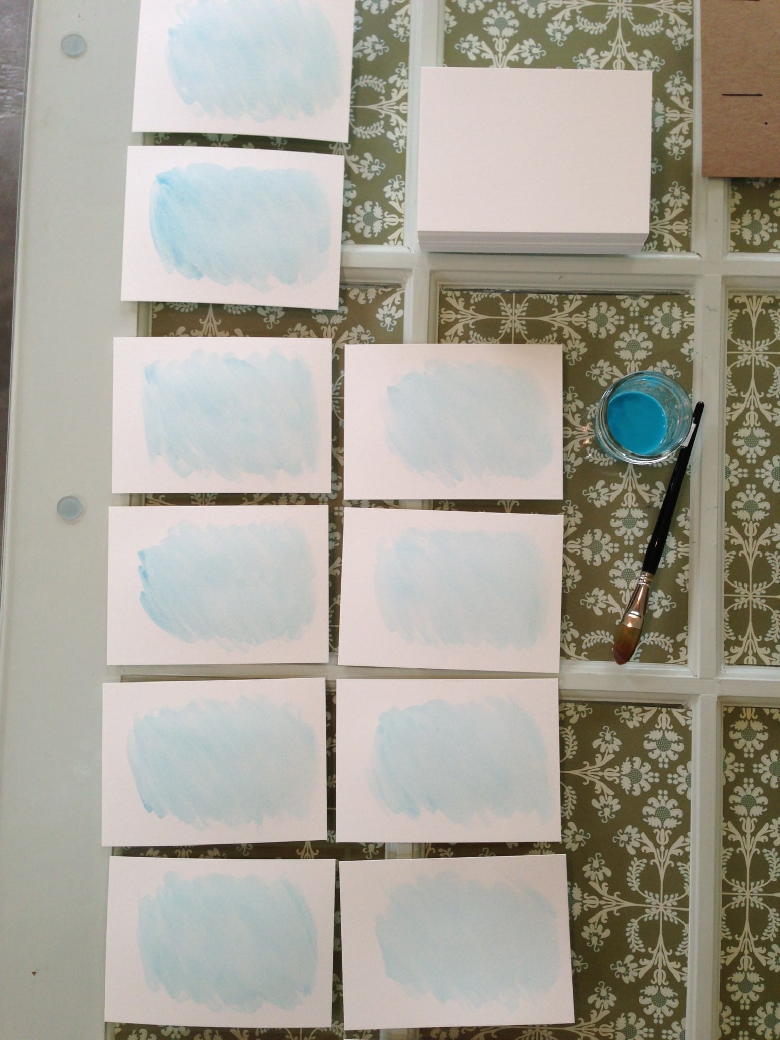
We emphasized the blue of the mason jar by adding a touch of light blue watercolor paint (and we painted everything before letterpress printing the pieces).
Each invitation was paired with a kraft envelope and stamped in white ink with the return address.
 

Personalized Letterpress Stationery

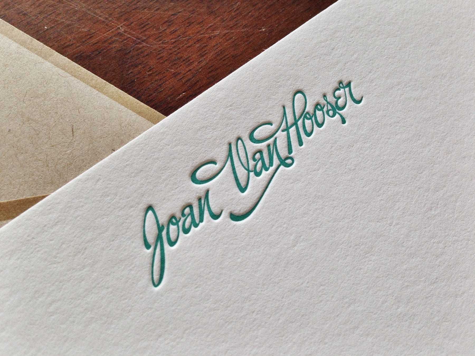
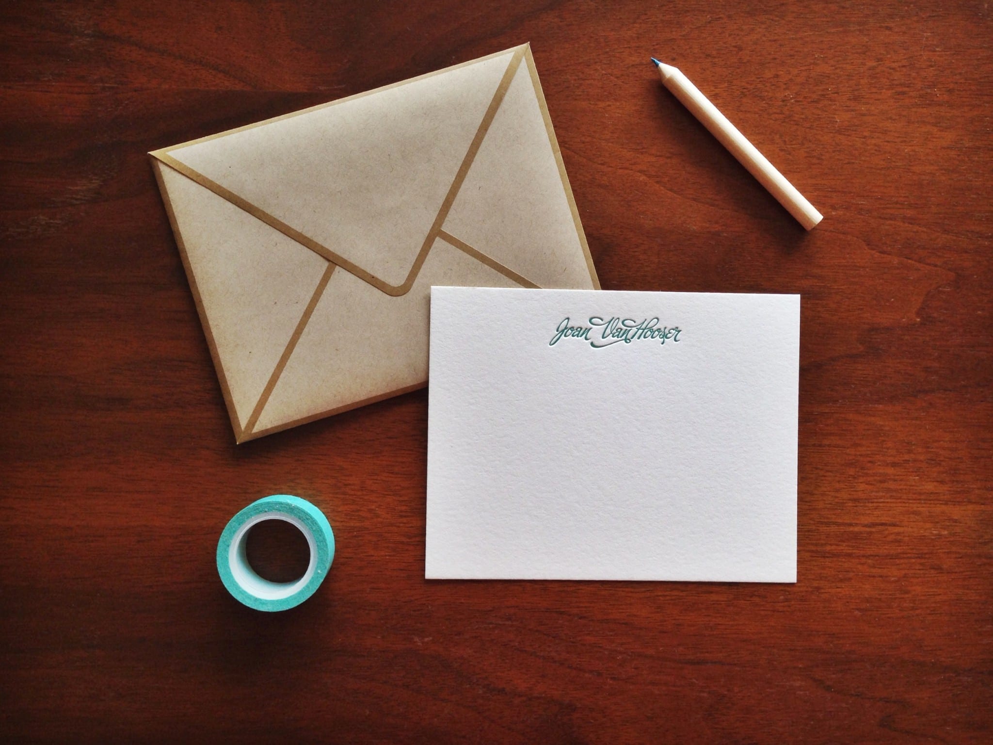
A handwritten note makes such an impact on the recipient, and personalized stationery makes it all the more special. Printed in a lovely dark teal ink, these A2 notecards are on 110-lb cotton paper, which is perfect for correspondence because it’s thick but not overwhelmingly so.

Interested in custom letterpress stationery? Learn more about INK MEETS PAPER Services


Modern Rustic Wedding Programs with Hand-Lettered Details

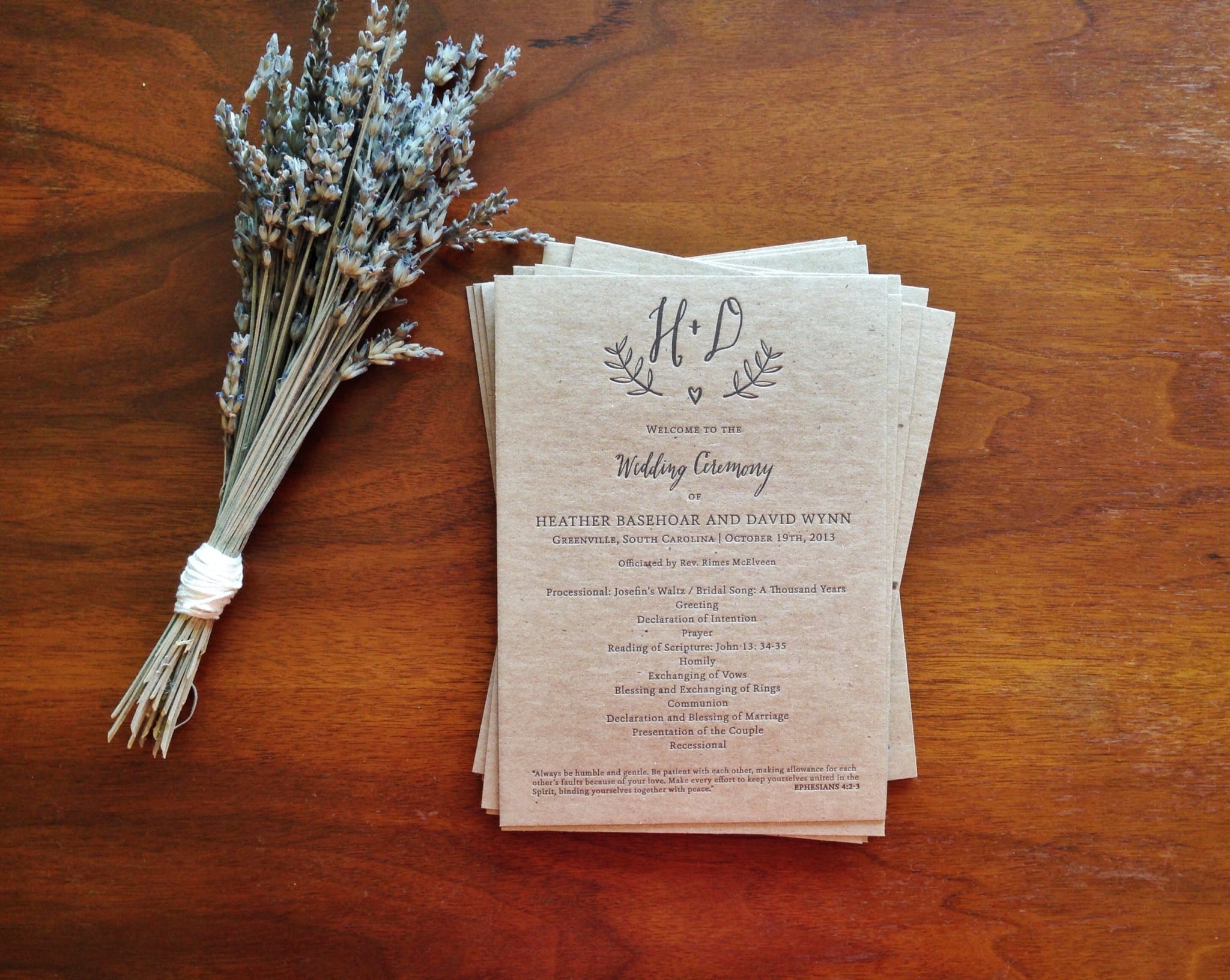
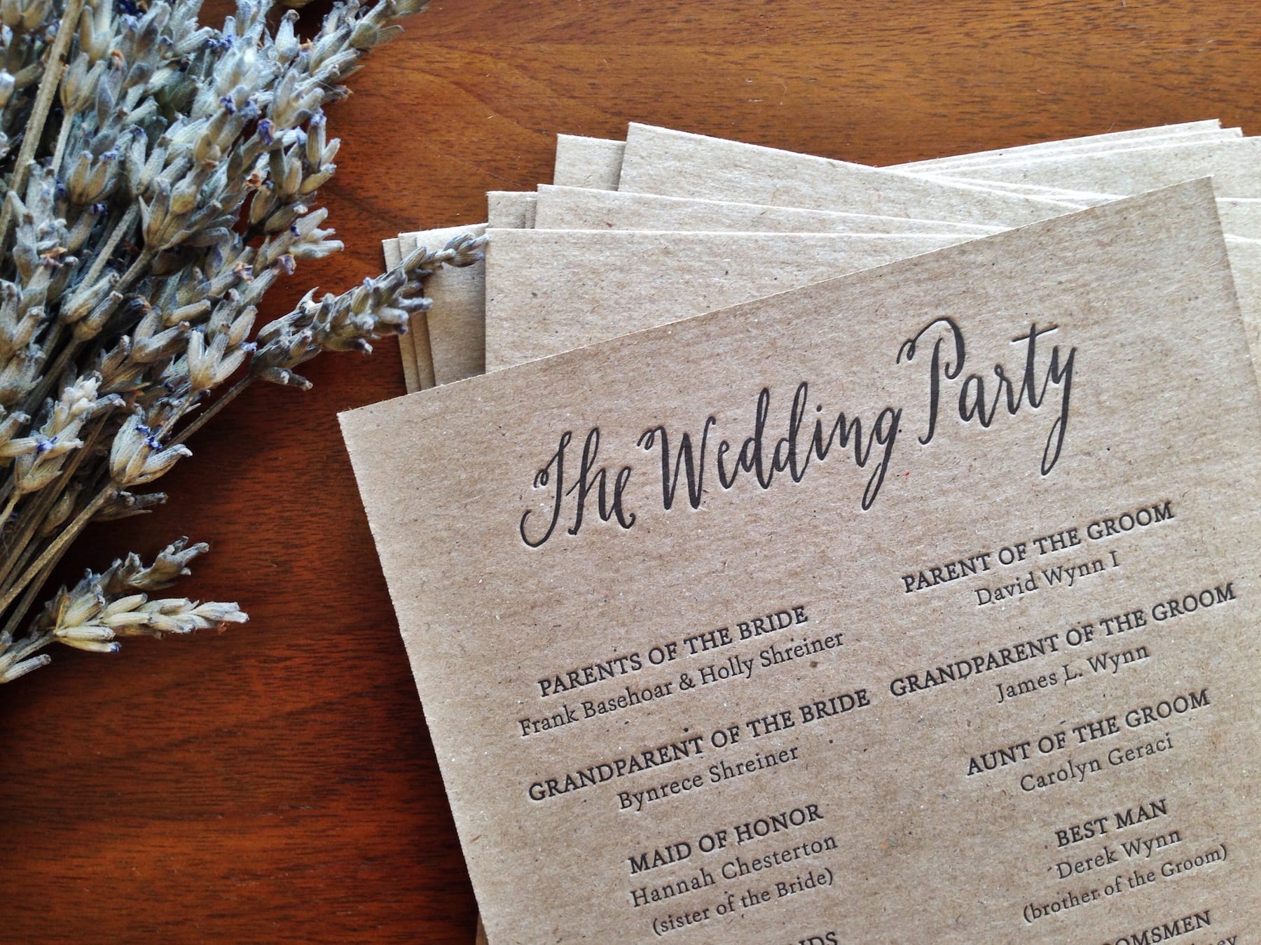
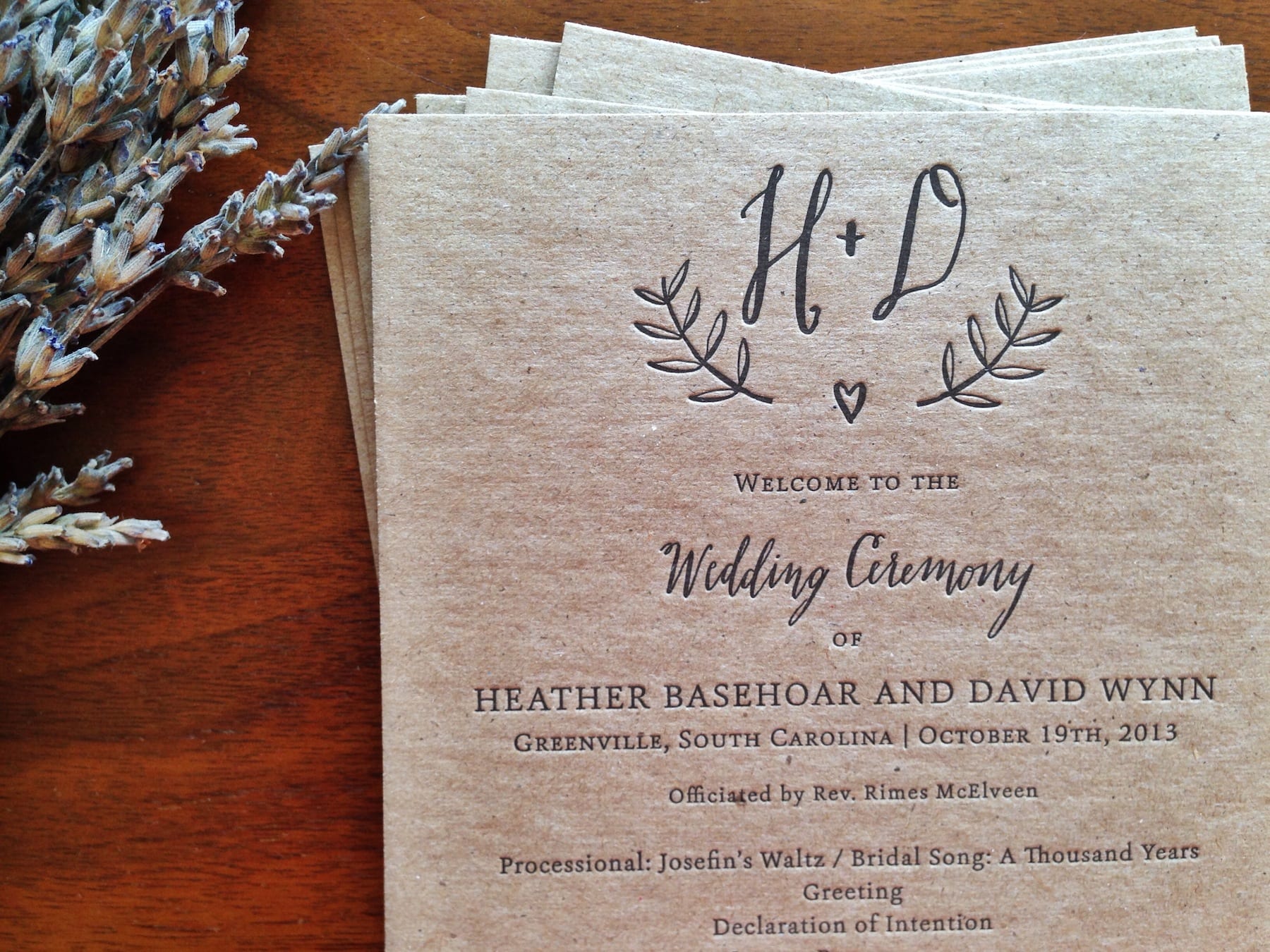
So often we print on light-colored paper (due to the transparency of letterpress inks), so it’s always a nice change to print on another stock like chipboard. Thick and recycled, the kraft brown chipboard was the perfect stock for Heather and David’s modern rustic wedding in Greenville, South Carolina (and we were thrilled to have been able to meet Heather in person at this past Indie Craft Parade).
I hand lettered a few elements for the piece, and a serif font complemented those nicely. The dark black ink made sure all of the wedding details were easy to read.

It was such a pleasure working with Heather and David, and we wish them all the best in their new life together!


Charleston Wine + Food Festival 2014 Cards

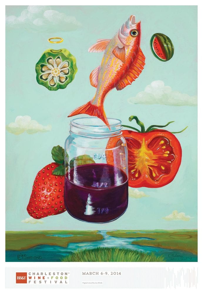
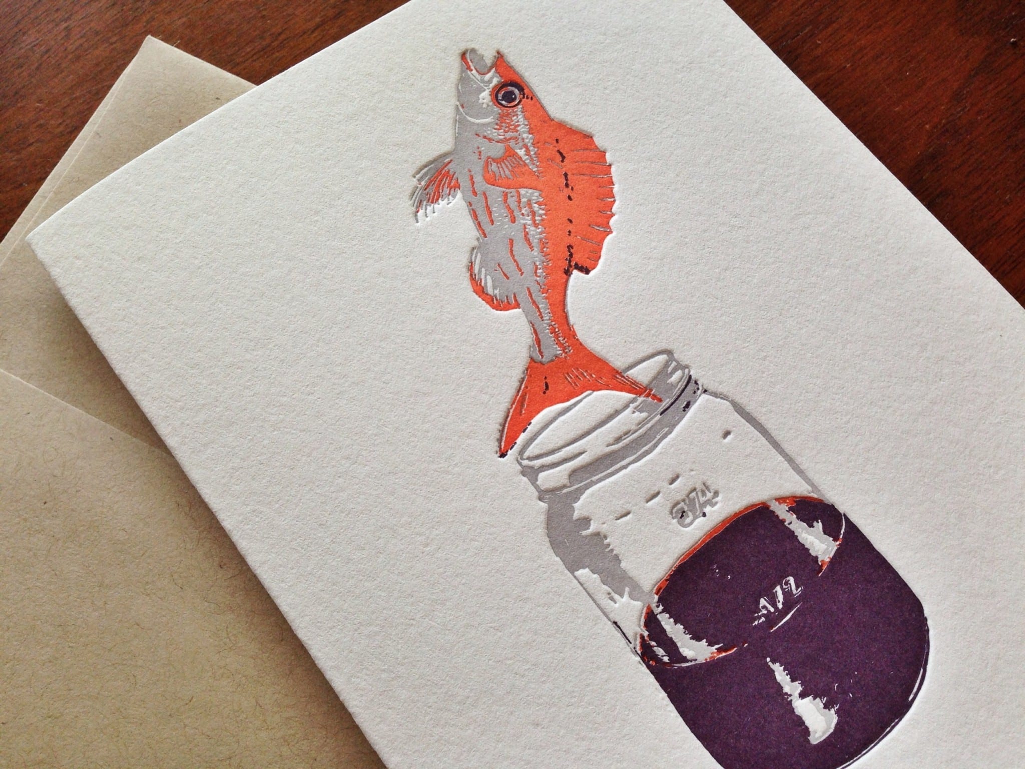
We were thrilled to work with Charleston Wine + Food Festival to print custom cards for the 2014 festival. Local artist Lisa Shimko did the painting for the upcoming festival poster.

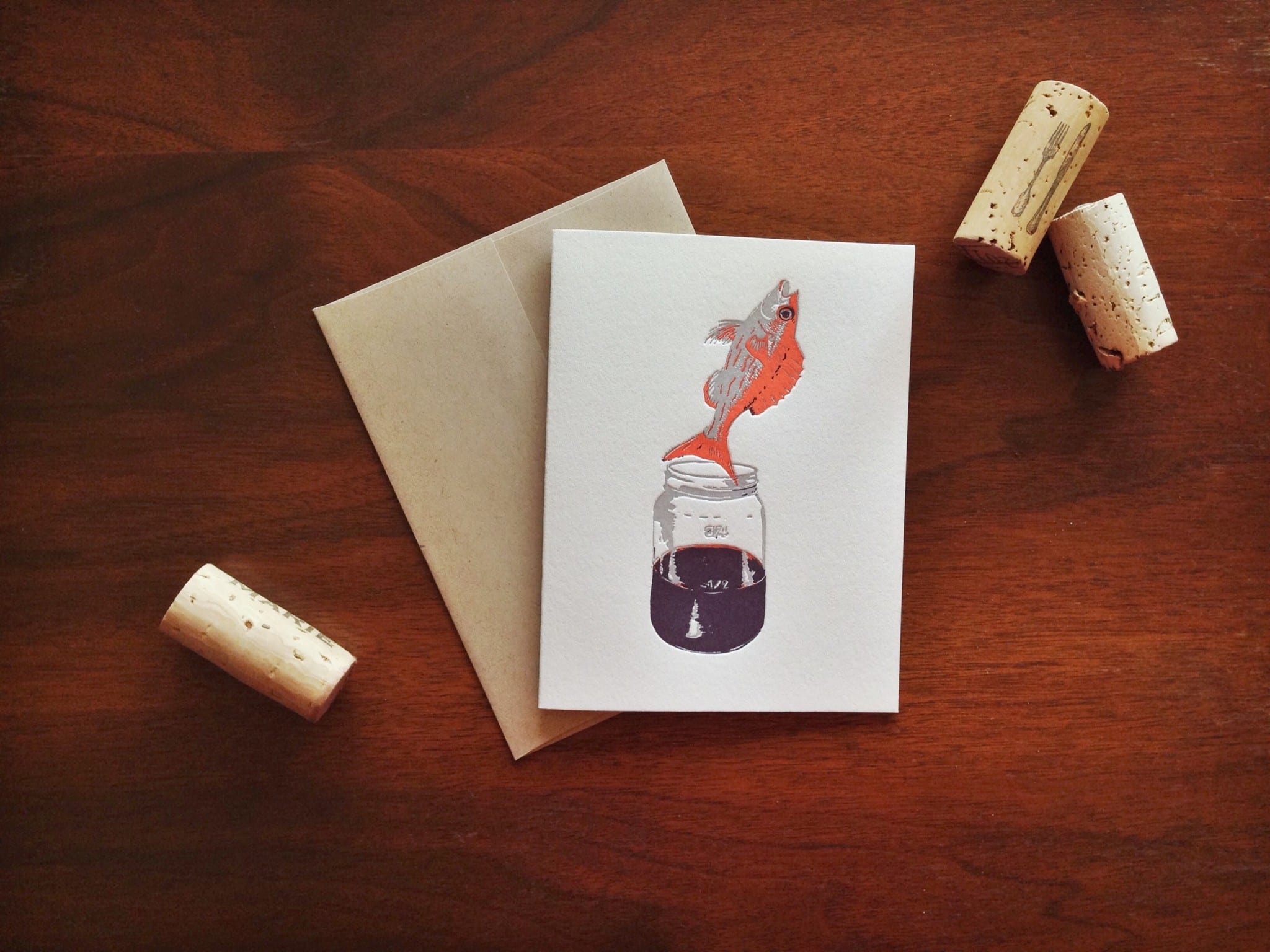
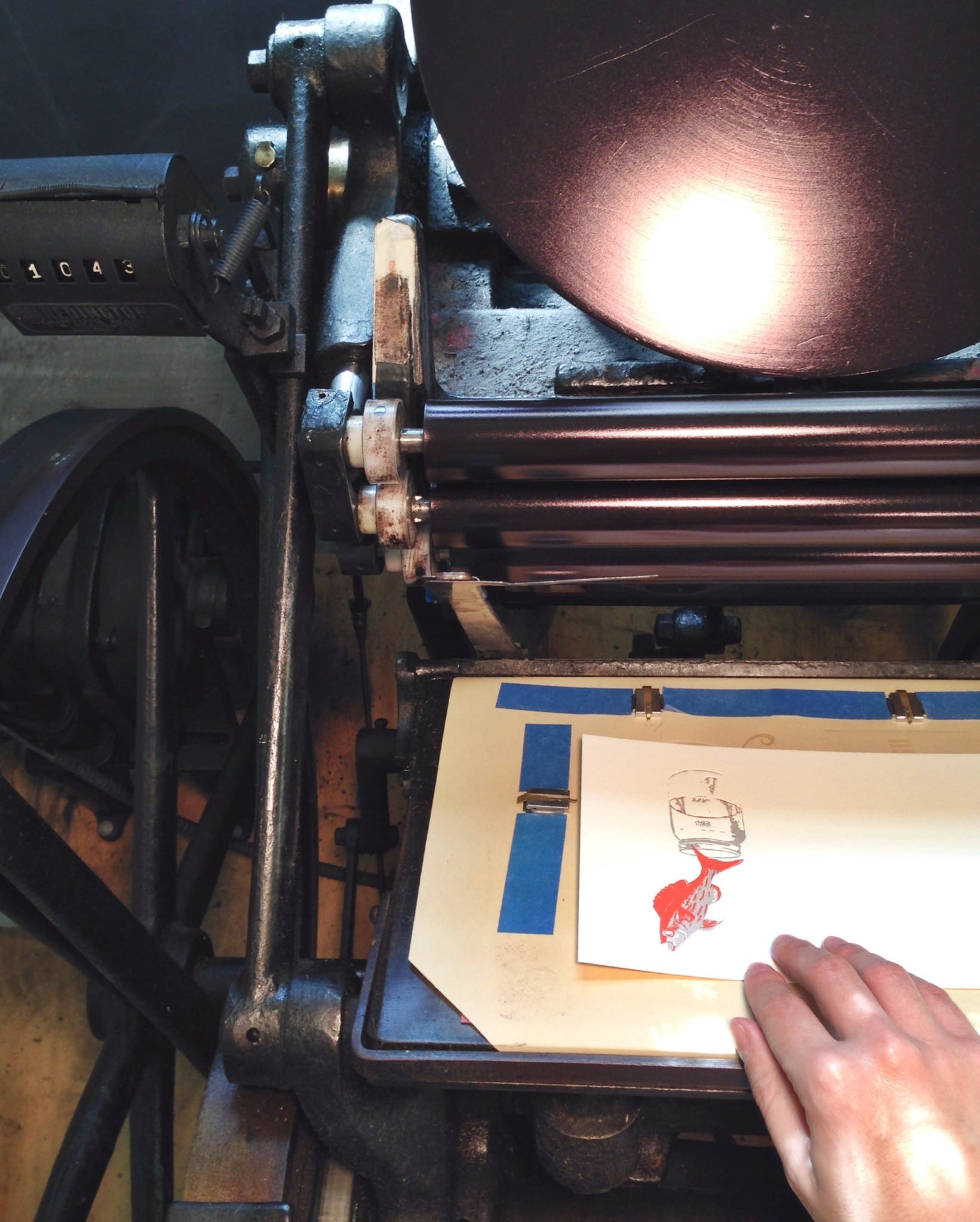
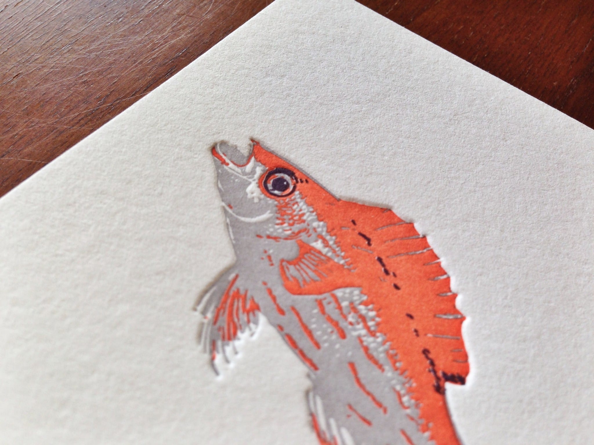
This was the first time we’ve printed a piece based off of a painting, and in order to reproduce the design via letterpress printing, we needed to break down the design for the card (the fish jumping out of the mason jar) into two or three colors max. We produced a three-color print using warm gray, bright orange, and plum-wine colors.

Charleston Wine and Food Letterpress Card

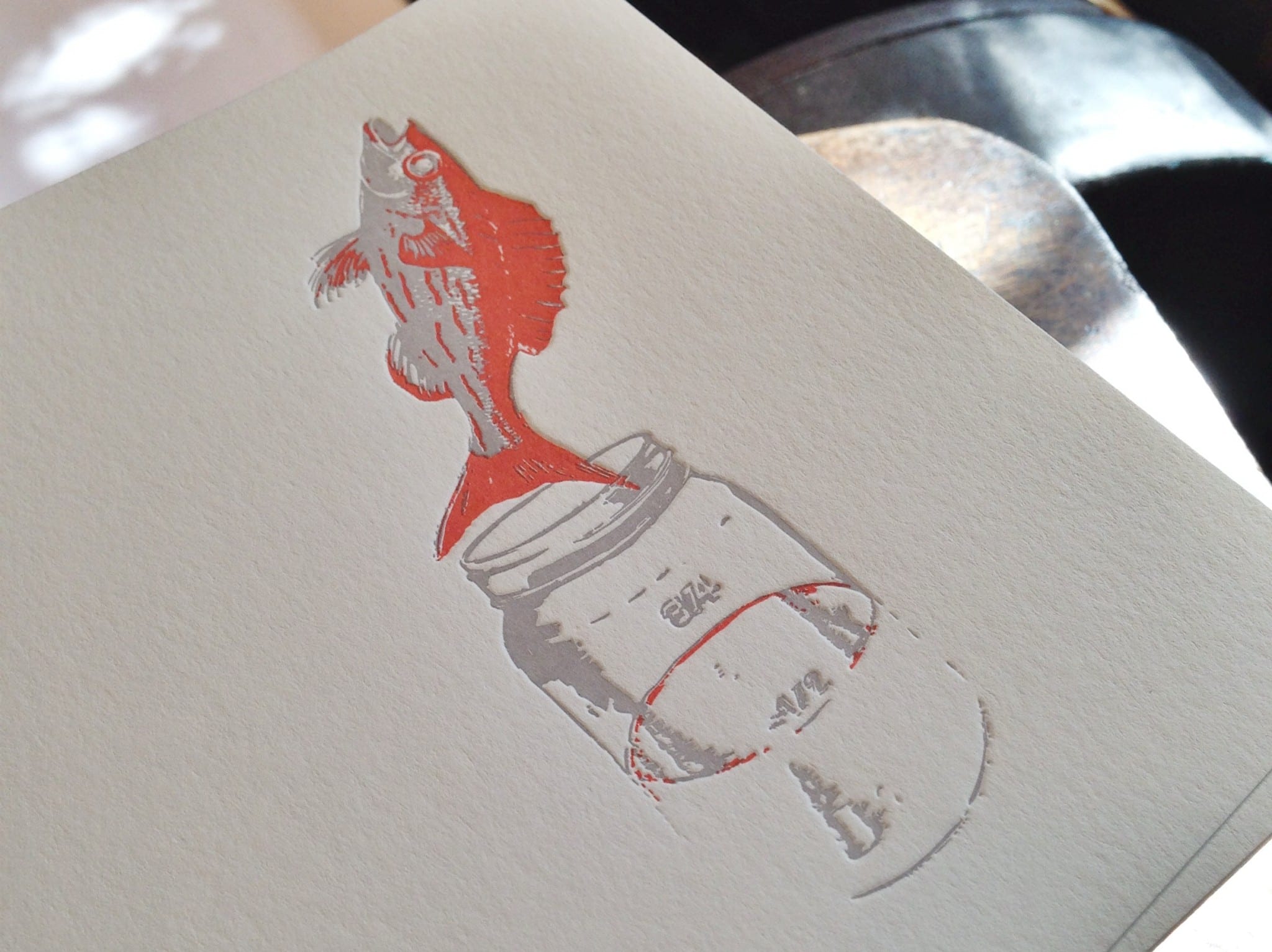
Since each color is a separate pass through the press, we weren’t able to see how the finished card would look until the end. Here’s an in-progress photo after printing the first two colors.

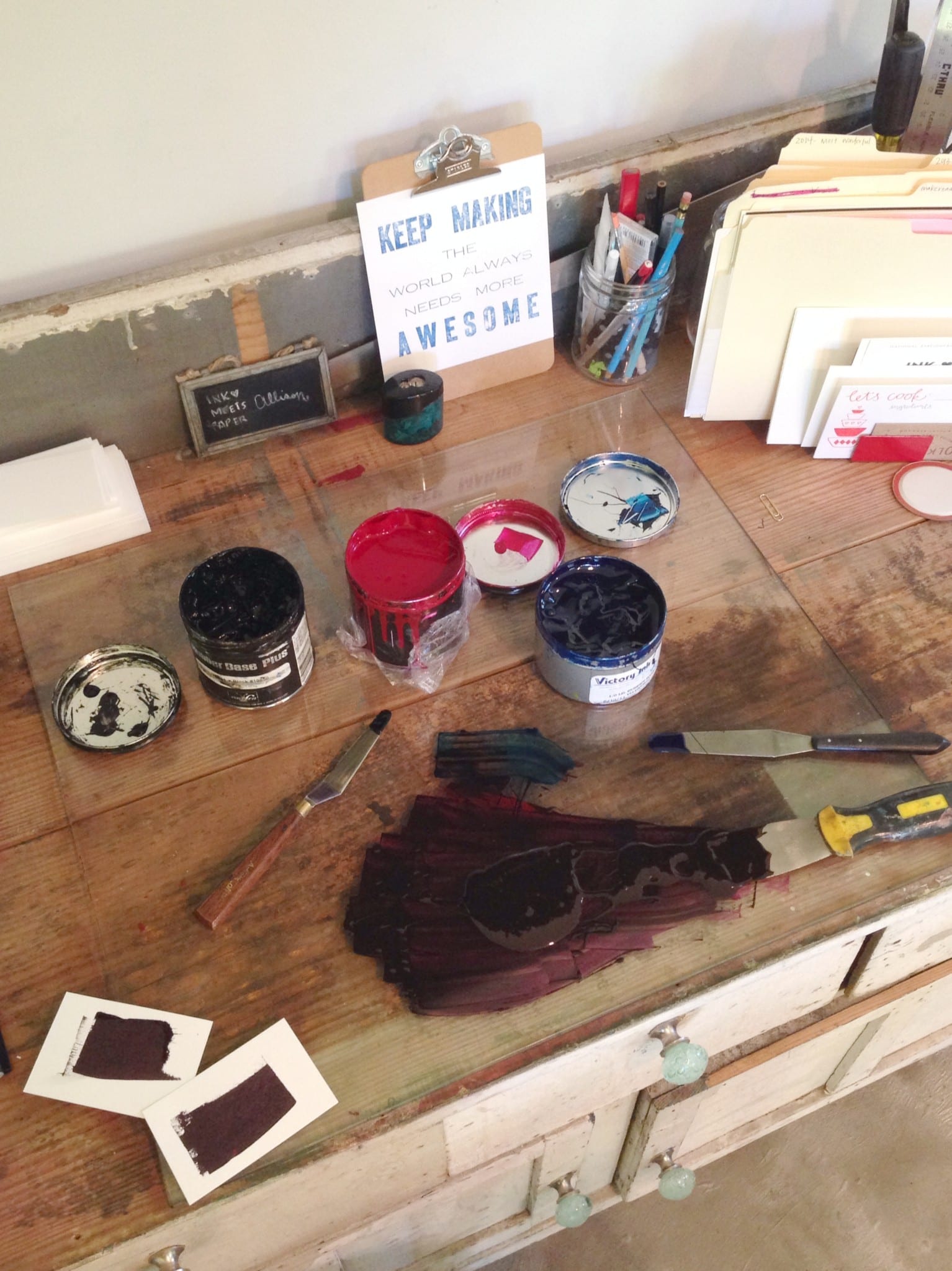
Each ink color was mixed by hand:

And then hand-fed into the press:

I love how the overprinting of the plum-wine color onto the orange actually looks like a fourth color (black):

Such a fun project! It really was amazing to see all of the colors come together to produce the end piece.

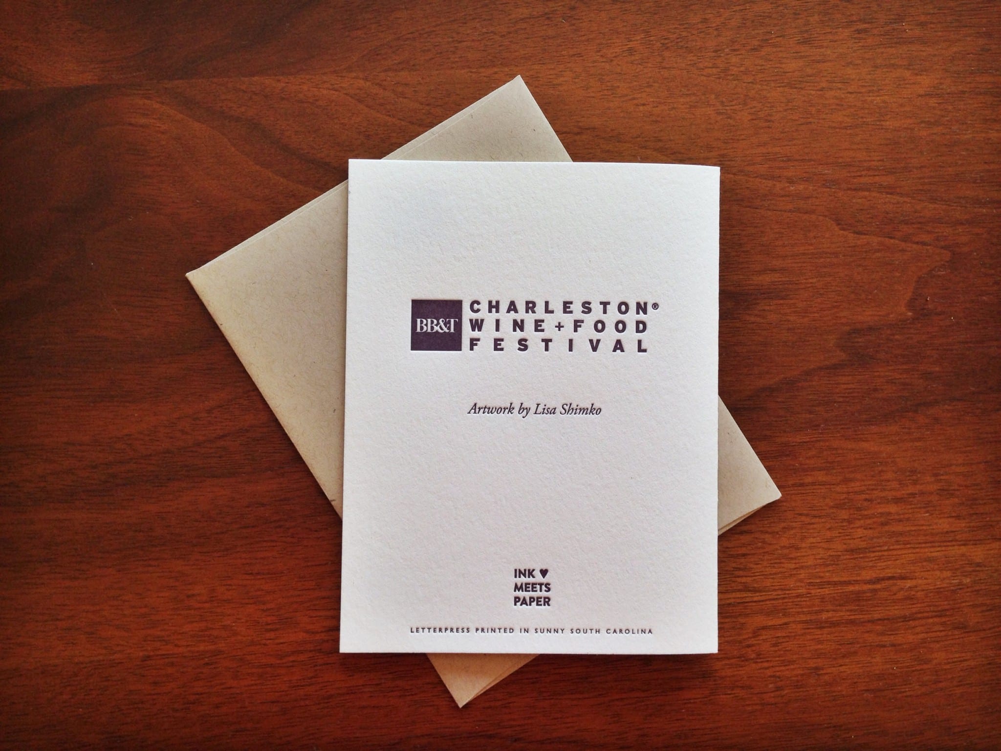
And along with picking up tickets to the 2014 festival, you can also purchase one of the cards (each card is paired with a recycled kraft envelope).

Hive Church Notecards

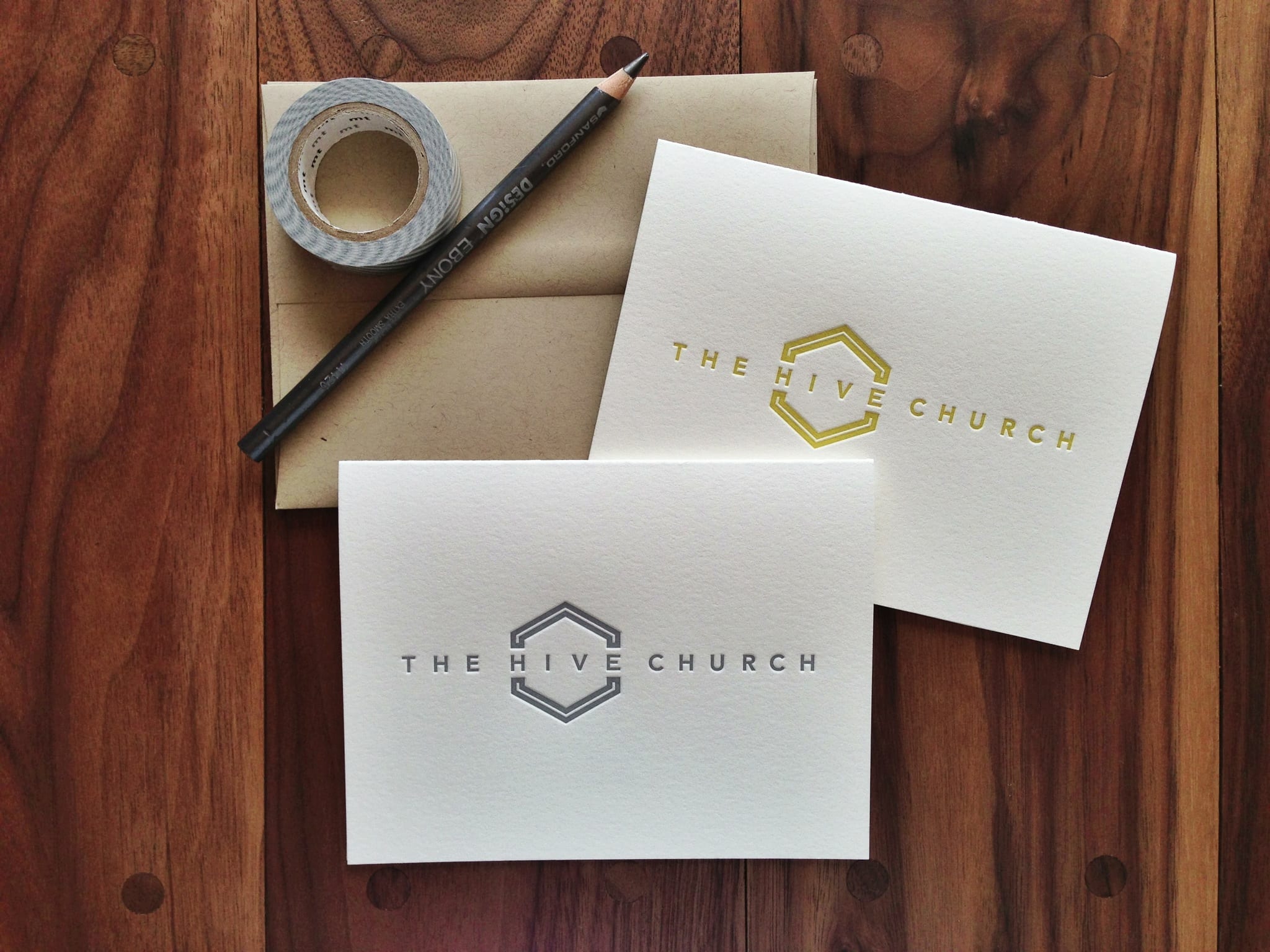
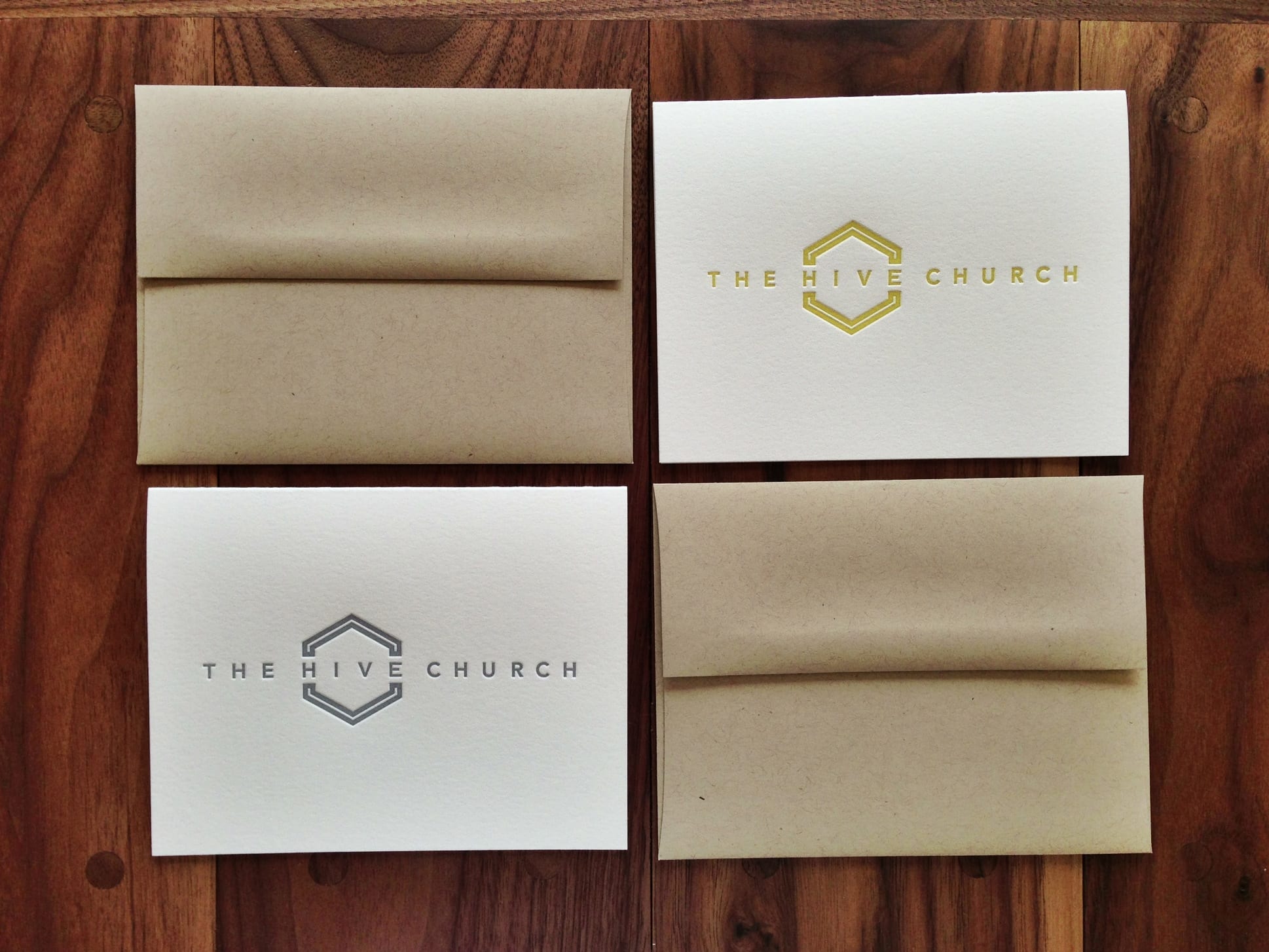
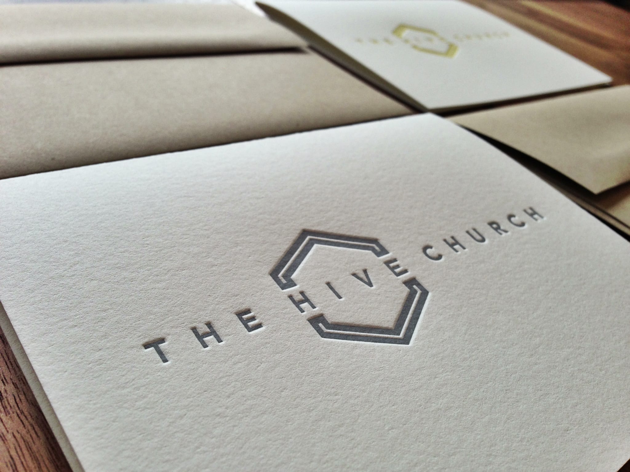
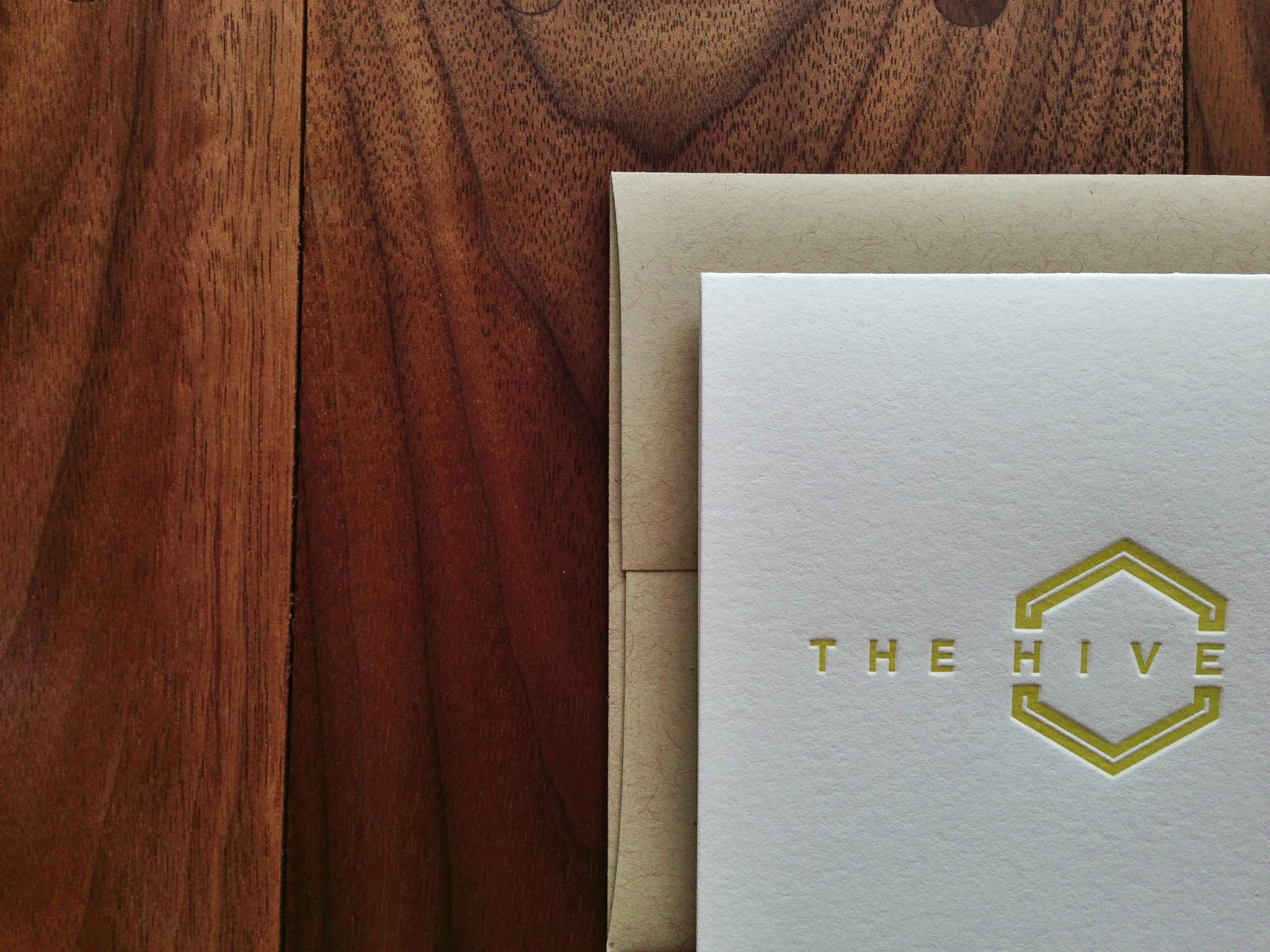
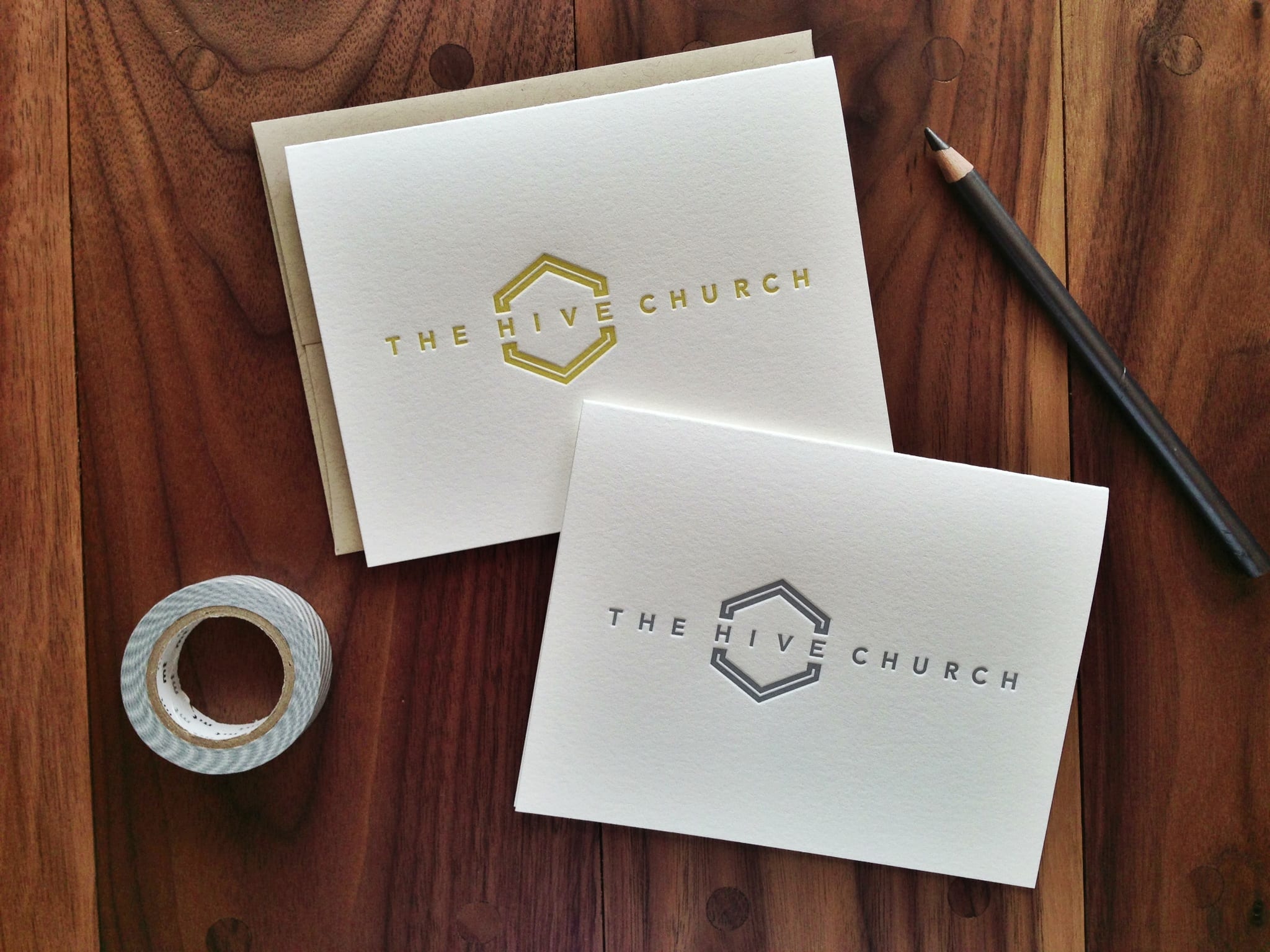
These custom letterpress notecards are a recent project for the awesome team at The Hive Church, a new urban church plant in the North Charleston area. We printed their logo (designed by Dan Romanoski) onto 110-lb cotton paper. Half of the cards were printed in gray, and the other half were printed in mustard yellow. The cards are paired with recycled kraft envelopes. The impression in the paper is really nice, and I think they’ll definitely make an impact on their recipients.