Category Archives: Custom

NSS 2015 Mailers

INK MEETS PAPER® pre-show mailer for the National Stationery Show

We’re NYC bound for the National Stationery Show in just a few short days (!!!) and can’t wait to share all of the new products that we’ve been working on over the past months. Designing and printing our pre-show mailer inviting retailers to visit our booth is always so much fun, and we loved how this year’s piece turned out.

This year’s mailer included a gray envelope with a letterpress-printed liner in our custom ink splatter pattern (which also coordinates with the pattern on our new business cards). As an extra detail, we included a hidden message that could be found if you looked further into the envelope.

Detail of letterpress-printed envelope liner

The 5×7 letterpress art print (“Life is best shared”) features a hand-lettered design, and it also serves as an introduction to our new product line, Gatherings. 

The invitation is letterpress printed in two colors on shimmery teal paper and highlights the key information about the show (booth no. 1453!), and the hand-drawn envelopes reiterate our love of snail mail and handwritten correspondence.

Close-up of pre-show mailer

See you in NYC!

New Letterpress Business Cards and Stationery for INK MEETS PAPER

This year’s domain change from inkmeetspaperpress.com to inkmeetspaper.com (hooray!) also meant that it was time for a bit of a refresh for our business cards and stationery. We kept our classic color palette of black/white/kraft throughout all of the pieces and used the ink splatter elements to tie the business cards and stationery together. 

I especially love how these smaller A2 note cards turned out, and they’re the perfect size for quick notes. The line at the bottom for the writer’s signature and email address not only makes them versatile for all of our team members, but it also subtly includes our social media handle (@inkmeetspaper) within the website address for another connection point. 

Our business cards are printed on super thick kraft chipboard with a classic black ink. The simple and classic design highlights the details like black edge painting, and I’m pretty smitten with the ink splatters (in two different patterns) on the backs of the cards. 

Business Cards for Sweeteeth

Sweeteeth Letterpress Business Cards | printed by INK MEETS PAPER

These business cards for our friend and fellow Park Circler Johnny Battles of Sweeteeth prove that you can make a big impact with black ink on white paper, and sometimes simple is best.

The Sweeteeth logo really pops against the paper, and the impression in the cotton paper is just wonderful. Limiting the contact information to just his name and @eatsweeteeth kept the card uncluttered and embraces the impact social media has in allowing customers to keep in touch with businesses (both small and large).

Sweeteeth Letterpress Business Cards | printed by INK MEETS PAPER

If you haven’t had a Sweeteeth chocolate bar (or a spoonful of the Salted Caramel Sauce), you’re really missing out. My favorite is the Sea is for Caramel (dark chocolate with a caramel filling and a sprinkling of sea salt). Not to mention, his workshop is just like a scene out of Charlie and the Chocolate Factory.

Johnny Battles of Sweeteeth

Custom Hand-Lettered and Edge-Painted Cards for the New Year

Before the first quarter of 2014 is over, I wanted to share our personal holiday cards. We sent this year’s cards out in January as a celebration of the upcoming year. Our goal was to encourage and inspire our friends and family with a card that wouldn’t be tucked away at the end of the season, and we also wanted something that was a bit interactive.

Using dip pen and ink, I hand lettered our wishes for them for 2014, and on the back, included the line “this year I (we) will:”  We letterpress printed the cards onto super-thick, 220-lb Crane’s Lettra using hand-mixed dark green ink.

We challenged ourselves at the start of the design to use the remainder of lime green envelopes from a long-ago custom project. In addition to the dark green ink, we chose yellow-orange to be a pop of contrasting color, using it in custom envelope liners with a hand-drawn pattern.

The edges were also painted that same yellow-orange color (and it’s amazing how much that bit of color along the edges can transform the entire piece). Since 220-lb paper is so thick, it works really well for edge painting.

I hand-lettered each recipient’s address using a dip pen and dark green ink.

It was such a fun project, and we were happy to be able to share it with our friends and family.

Cheers to an amazing 2014!

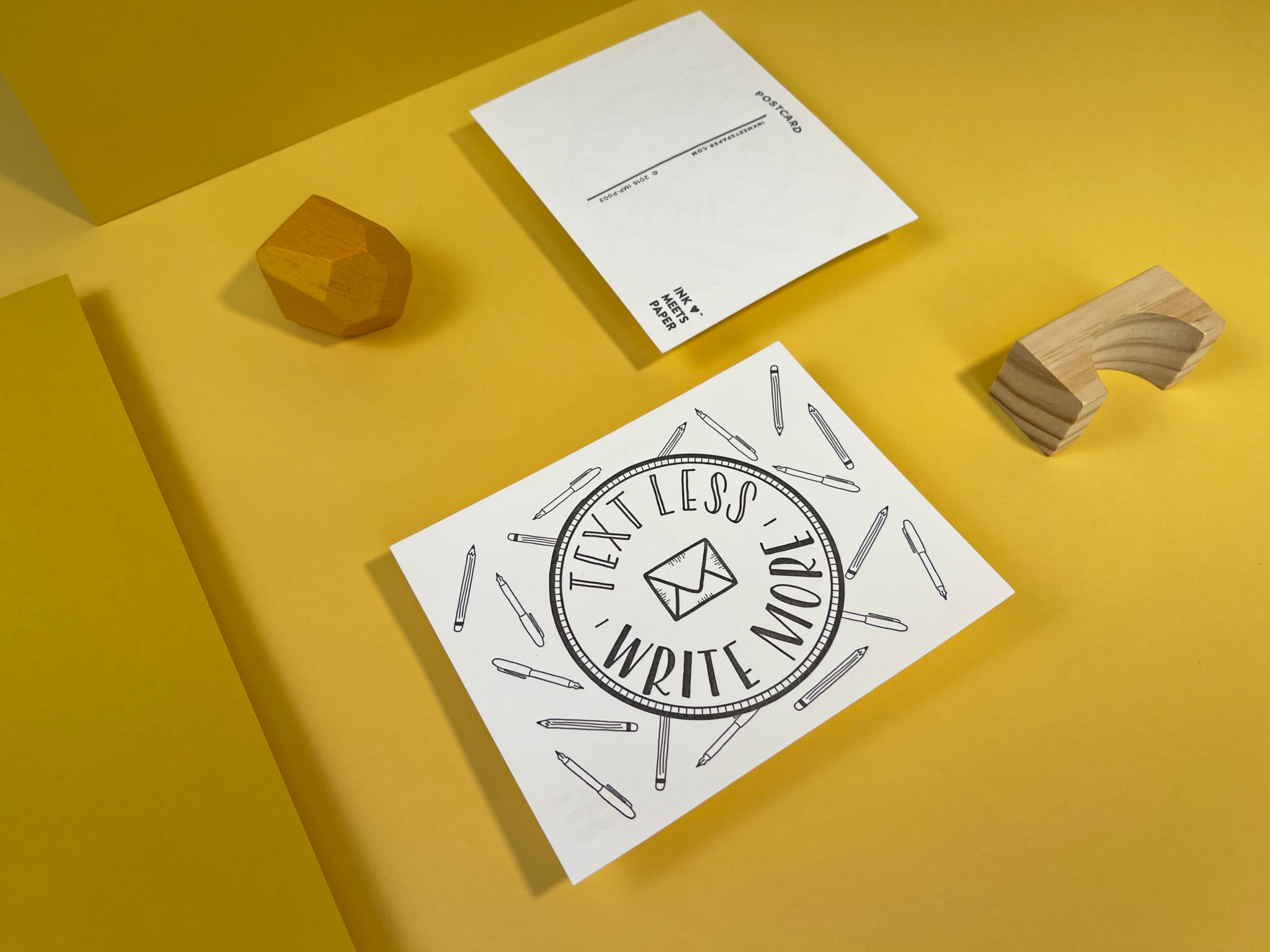
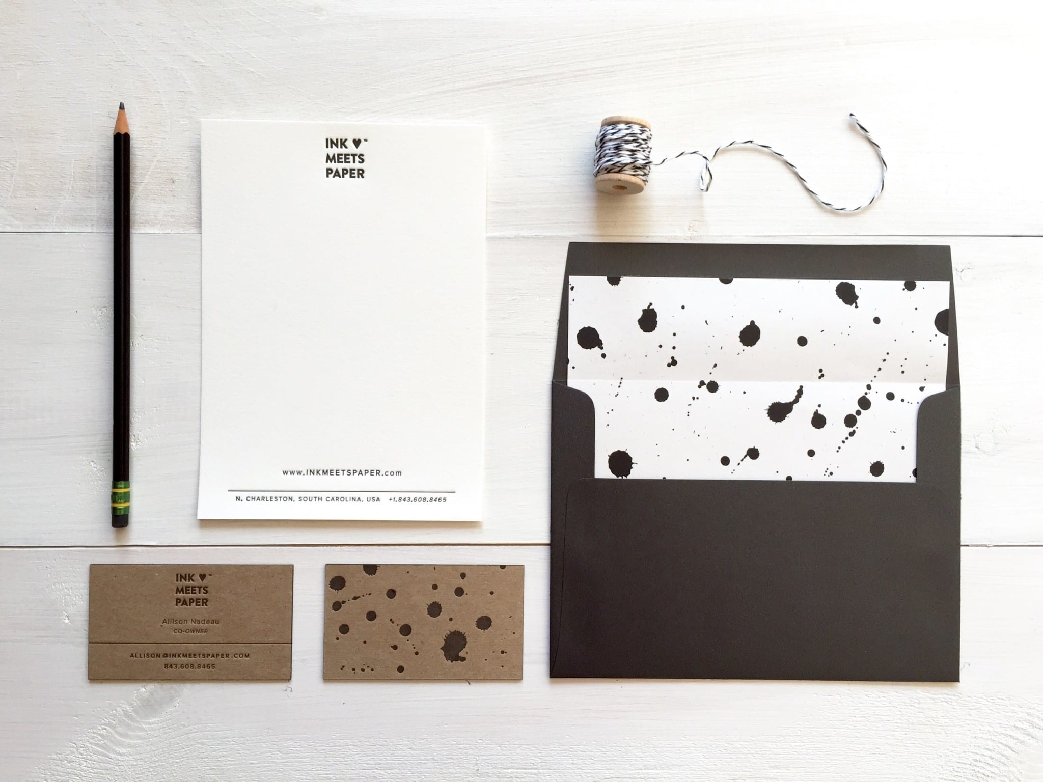
(Also, interested in custom letterpress printing or hand-lettering? Learn more about INK MEETS PAPER Services