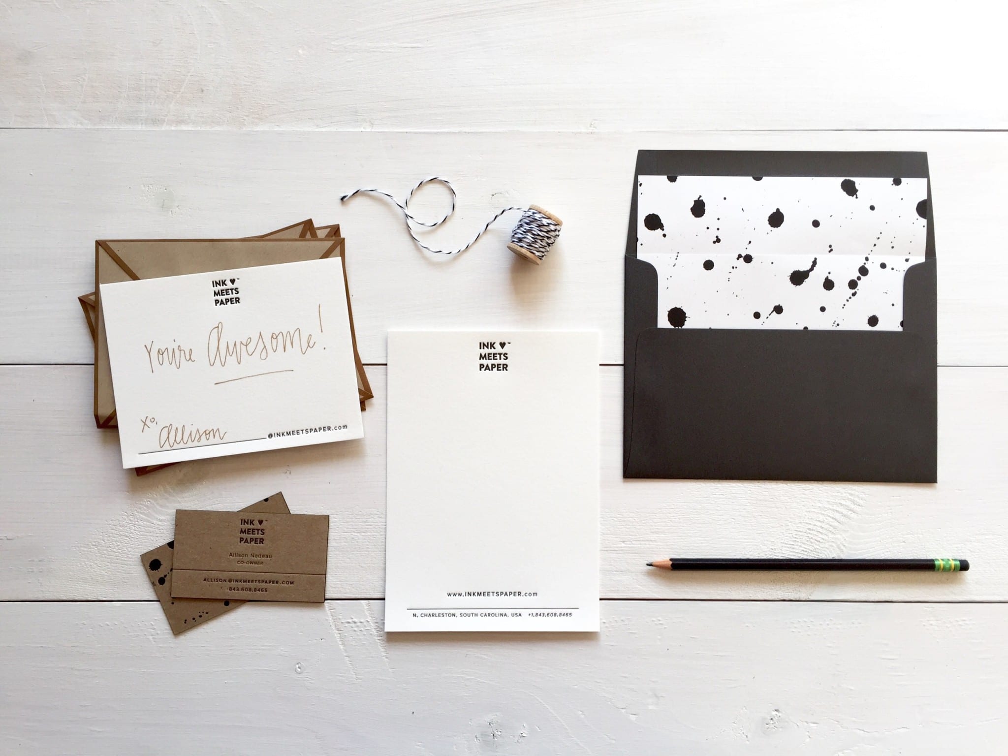
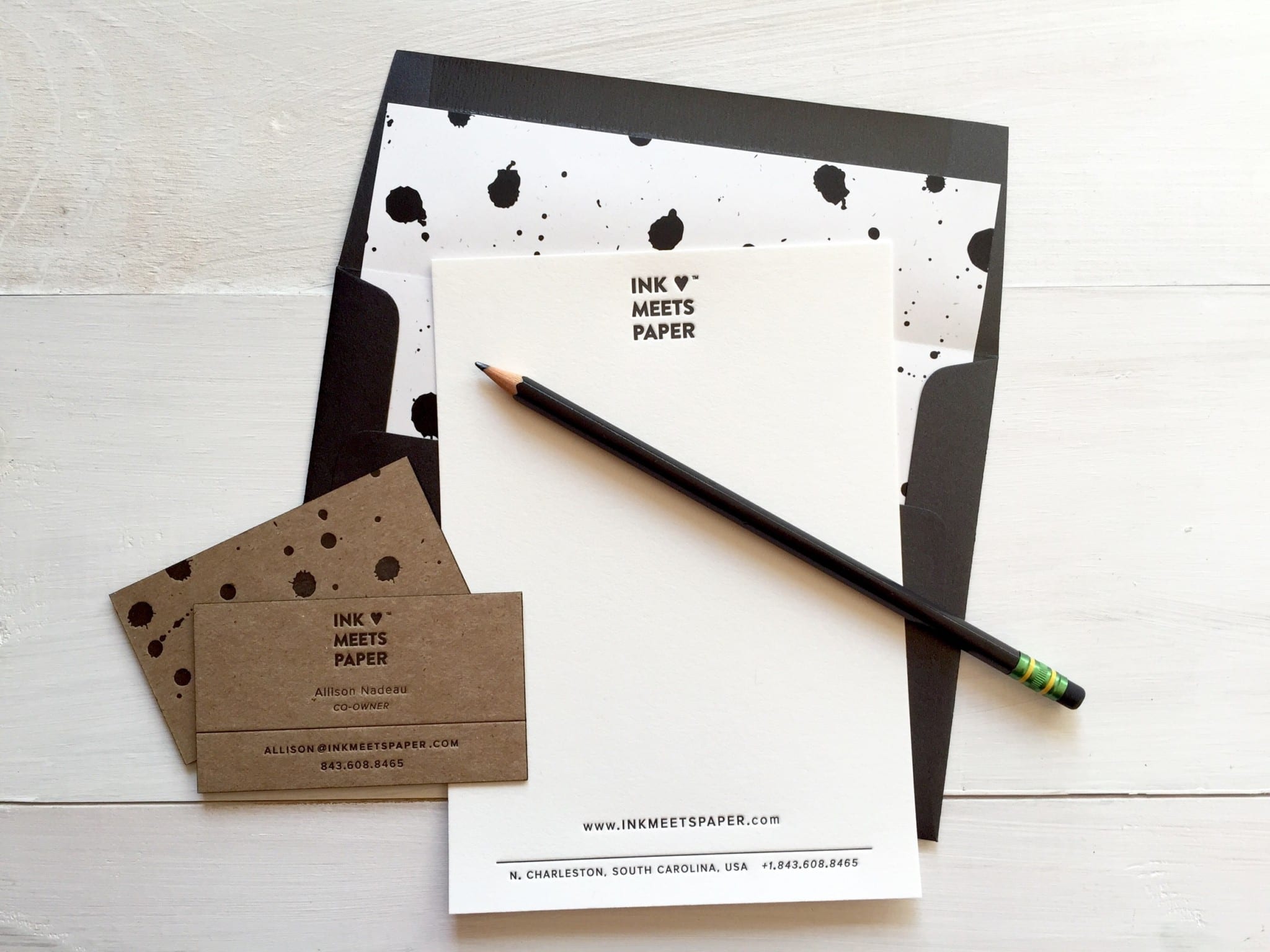
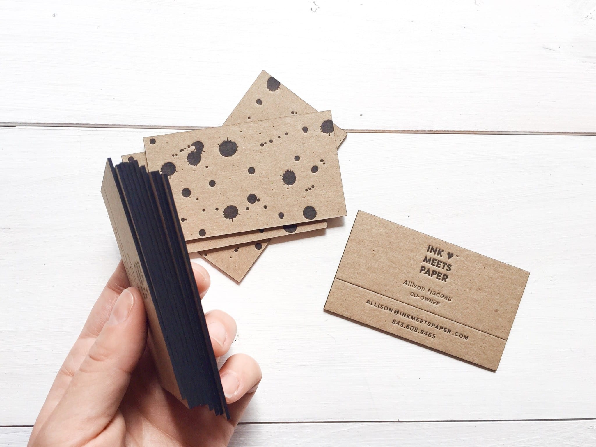
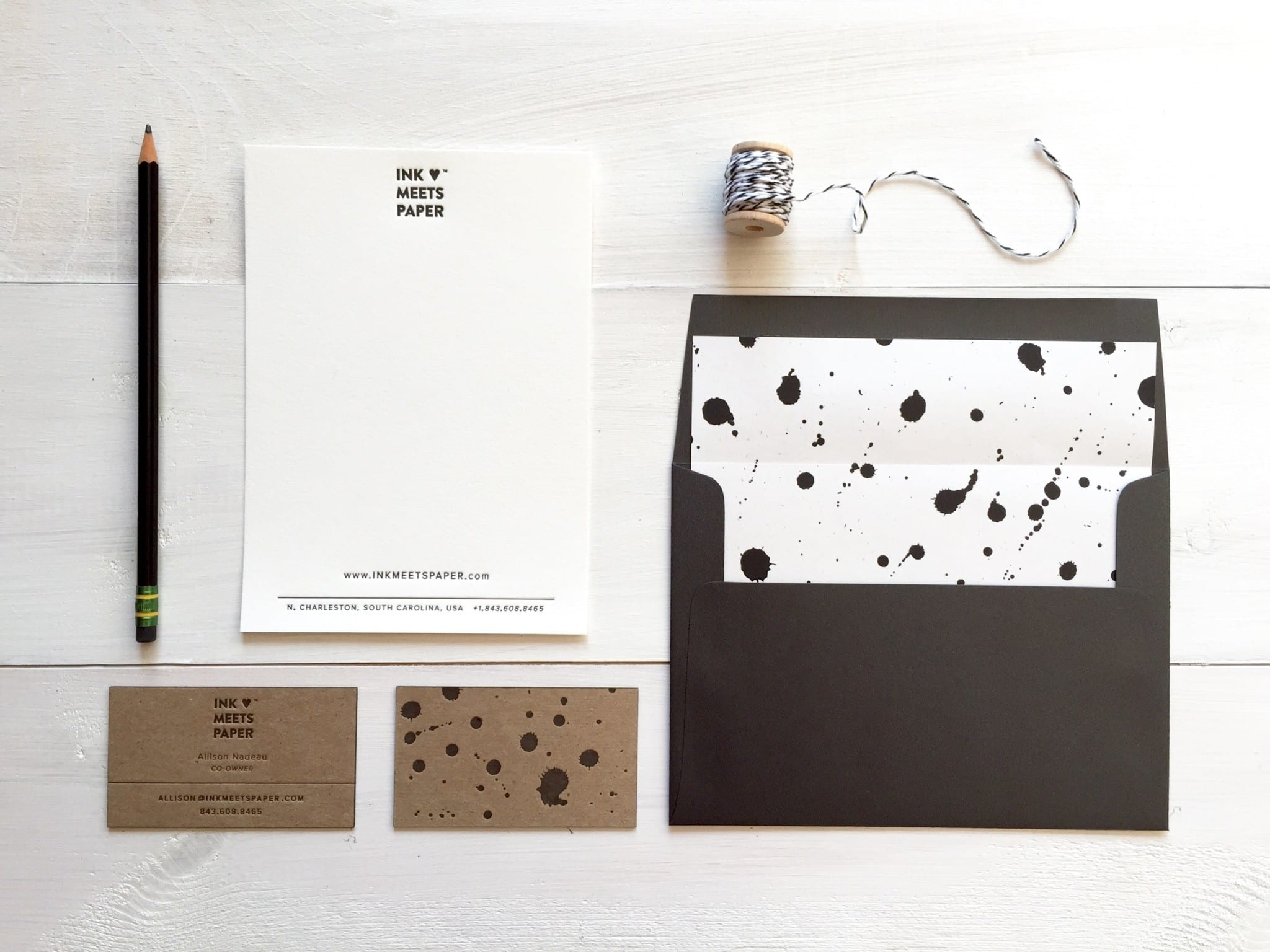
This year’s domain change from inkmeetspaperpress.com to inkmeetspaper.com (hooray!) also meant that it was time for a bit of a refresh for our business cards and stationery. We kept our classic color palette of black/white/kraft throughout all of the pieces and used the ink splatter elements to tie the business cards and stationery together.
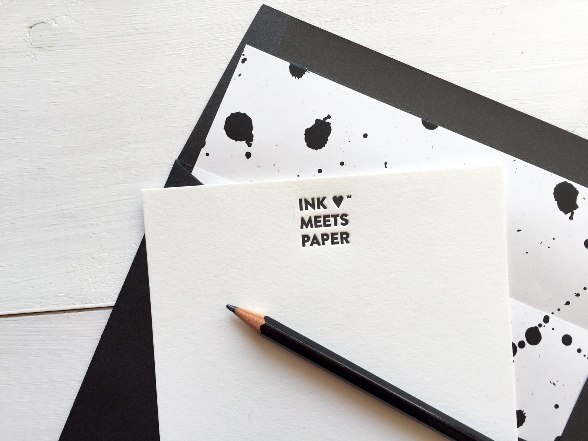
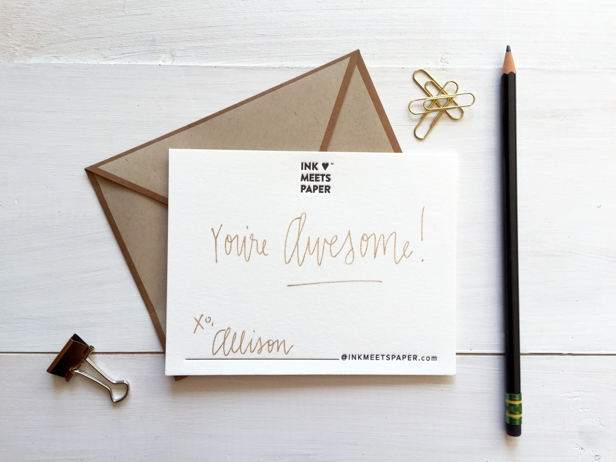
I especially love how these smaller A2 note cards turned out, and they’re the perfect size for quick notes. The line at the bottom for the writer’s signature and email address not only makes them versatile for all of our team members, but it also subtly includes our social media handle (@inkmeetspaper) within the website address for another connection point.
Our business cards are printed on super thick kraft chipboard with a classic black ink. The simple and classic design highlights the details like black edge painting, and I’m pretty smitten with the ink splatters (in two different patterns) on the backs of the cards.

Loving the new splattered ink! So fun! Congrats on a great refresh to your brand!
Thanks so much, Missy!