Hello, Spring!

Hooray for longer days filled with sunshine and warmer weather! We’re welcoming the buttercups that are peeking their heads through the ground– it seemed like winter dragged on way too long this year (and, admittedly, we’re winter wimps living here in the south, and we felt for all of you stuck with so much snow and ice).
We’re kicking off springtime with a couple of new Easter designs– each featuring a bright, cheery coral ink to combat the last bit of the winter blues.

IMP-4003 - Hoppy Easter Letterpress Card | INK MEETS PAPER 
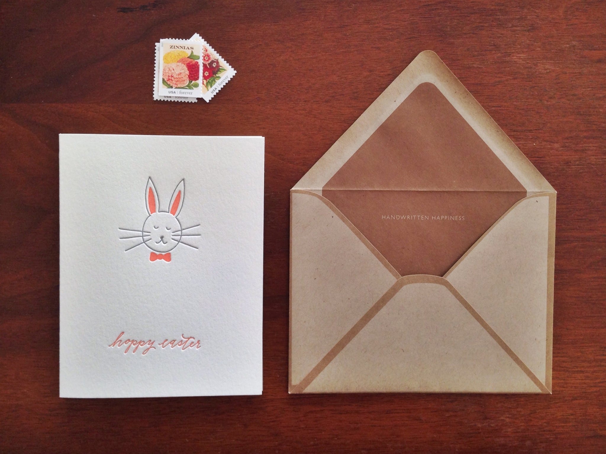
IMP-4003 – Hoppy Easter Letterpress Card | INK MEETS PAPER® IMP-4003-S - Hoppy Easter Letterpress Card Set | INK MEETS PAPER 
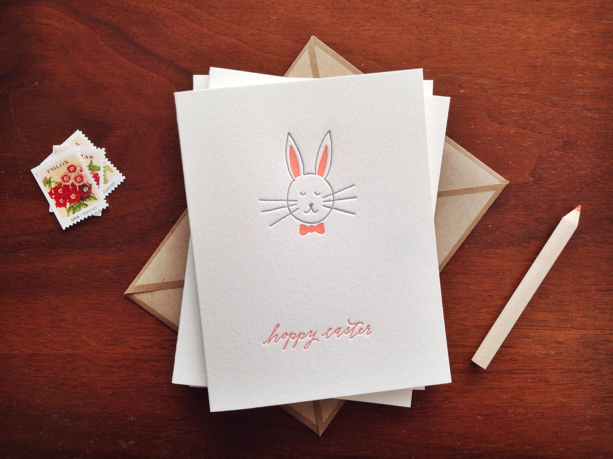
IMP-4003-S – Hoppy Easter Letterpress Card Set | INK MEETS PAPER IMP-4002 - Happy Easter Letterpress Card | INK MEETS PAPER 
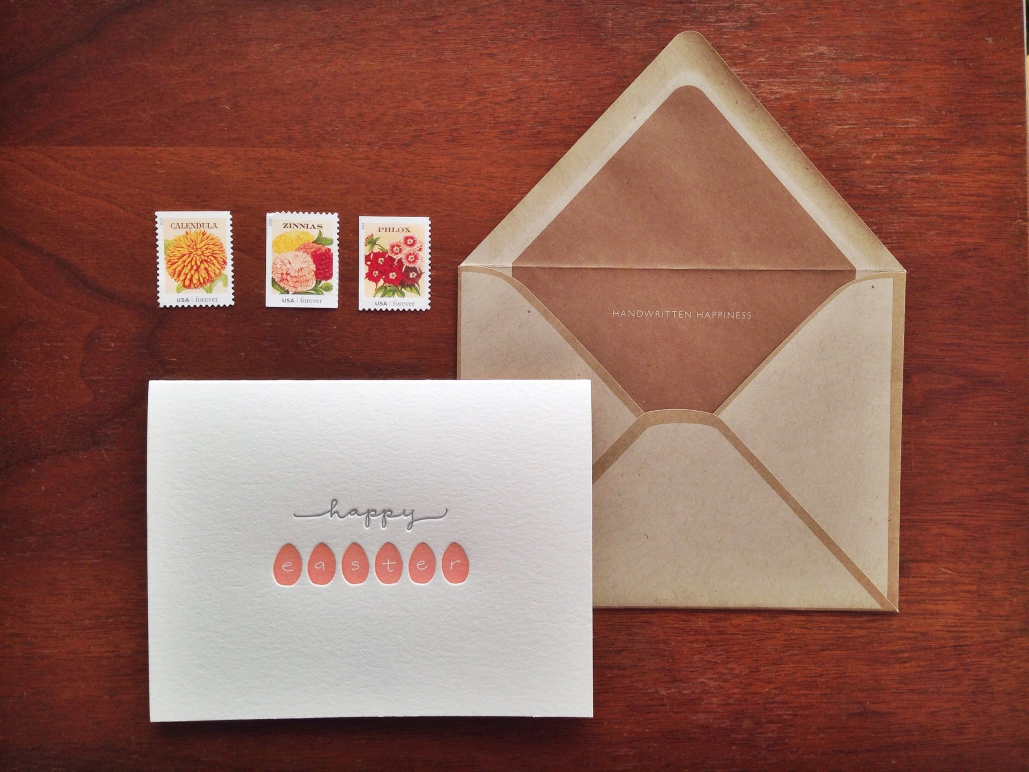
IMP-4002 – Happy Easter Letterpress Card | INK MEETS PAPER IMP-4002-S - Happy Easter Letterpress Card Set | INK MEETS PAPER 
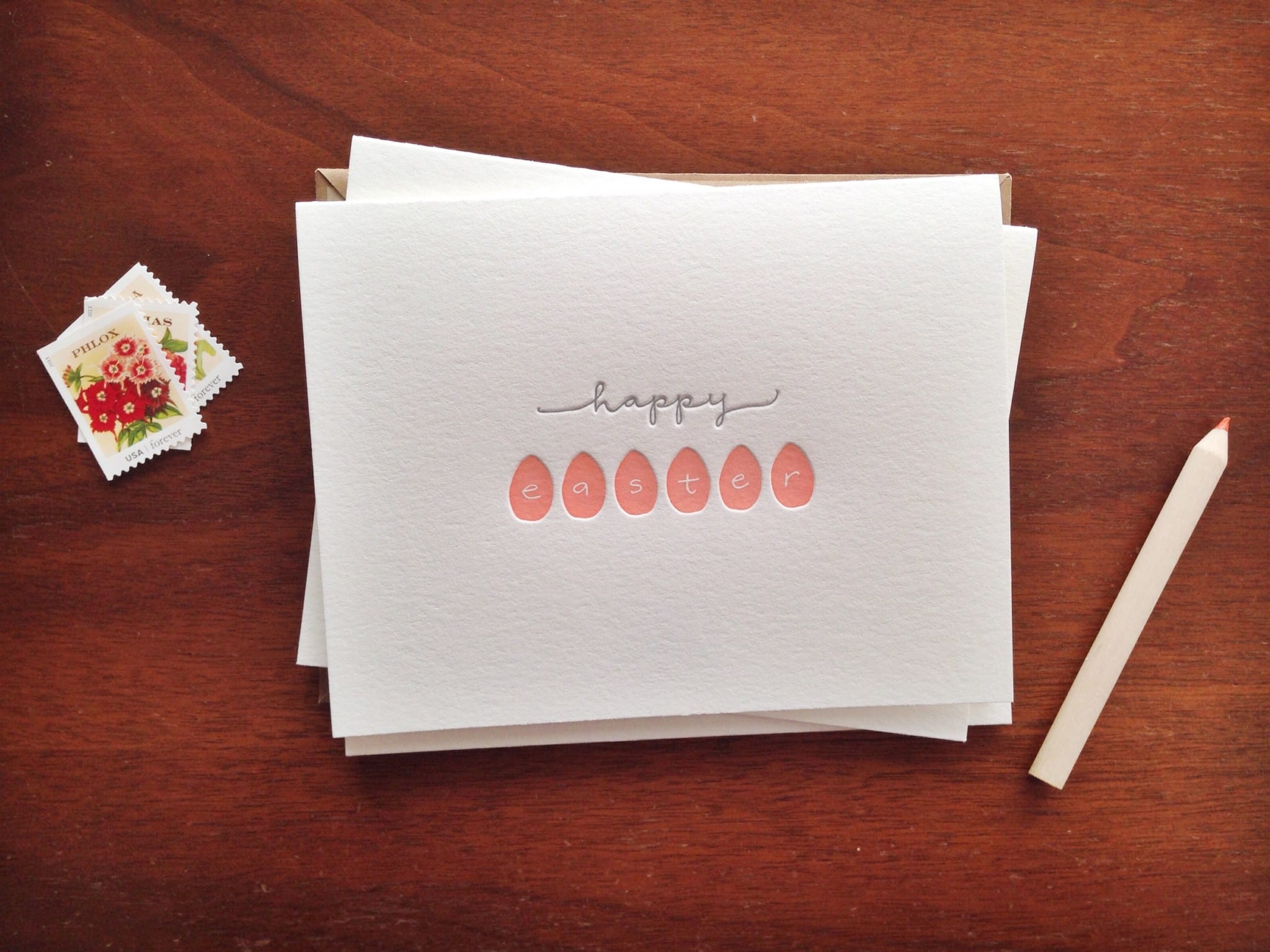
IMP-4002-S – Happy Easter Letterpress Card Set | INK MEETS PAPER

Each design is available as a single or boxed set of six. Browse the entire Easter collection online or find an INK MEETS PAPER stockist near you.

Custom Hand-Lettered and Edge-Painted Cards for the New Year

Before the first quarter of 2014 is over, I wanted to share our personal holiday cards. We sent this year’s cards out in January as a celebration of the upcoming year. Our goal was to encourage and inspire our friends and family with a card that wouldn’t be tucked away at the end of the season, and we also wanted something that was a bit interactive.

Using dip pen and ink, I hand lettered our wishes for them for 2014, and on the back, included the line “this year I (we) will:”  We letterpress printed the cards onto super-thick, 220-lb Crane’s Lettra using hand-mixed dark green ink.

We challenged ourselves at the start of the design to use the remainder of lime green envelopes from a long-ago custom project. In addition to the dark green ink, we chose yellow-orange to be a pop of contrasting color, using it in custom envelope liners with a hand-drawn pattern.

The edges were also painted that same yellow-orange color (and it’s amazing how much that bit of color along the edges can transform the entire piece). Since 220-lb paper is so thick, it works really well for edge painting.

I hand-lettered each recipient’s address using a dip pen and dark green ink.

It was such a fun project, and we were happy to be able to share it with our friends and family.

Cheers to an amazing 2014!

(Also, interested in custom letterpress printing or hand-lettering? Learn more about INK MEETS PAPER Services


Love is in the Air!

It’s hard to believe that we’re over half way through January… and we’re right on the heels of Valentine’s Day. We’ve been busy in the studio designing and printing, and are excited to release this year’s Valentine’s cards (available in stores and online). The designs are hand lettered and then made into photopolymer plates for printing. We were excited to break in a new tin of metallic gold ink with these cards. Although it doesn’t appear quite as metallic since it’s on cotton paper, it’s still the loveliest gold color.

All of our cards are blank on the inside– perfect for that love letter.

And perfect for sharing with your friends (these are available as boxed sets of six cards)… because handwritten notes brighten everyone’s day.

And speaking of ways to brighten someone’s day, Etsy coordinates an awesome Special Delivery project to spread handwritten cheer. They partner “with Citymeals-on-Wheels to bring nutritious meals, handmade greeting cards and companionship to elderly Americans.” Specific details are available here, and the deadline to receive the cards is February 3, 2014.

Happy writing!


Watercolor Mason Jar Rehearsal Dinner Invitations

Lindley and Winfred had their rehearsal dinner at the Mercantile Deli, a charming restaurant in downtown Franklin, Tennessee that’s known for its delicious southern fare and tables decorated with fresh flowers in blue mason jars.


For the invitation design, we wanted a hand-drawn piece that connected to the restaurant’s decor and would immediately let guests know the dinner’s atmosphere would be casual and relaxed. All of the text is hand-lettered, and the couple’s names act as the jar’s brand/label.

We emphasized the blue of the mason jar by adding a touch of light blue watercolor paint (and we painted everything before letterpress printing the pieces).

Each invitation was paired with a kraft envelope and stamped in white ink with the return address.


Winter Holiday Cards 2013

It’s hard to believe that Christmas is only a few short weeks away (ahhhh!). But it’s not too late to send out handwritten cards to friends and family. We added three new cards to our line this year (bringing our winter holiday collection to seventeen designs).

We focused on classic holiday icons, and each design is hand drawn: a tree, ornament, and gift. Paired with our signature kraft envelope, they’ll definitely bring handwritten holiday cheer.