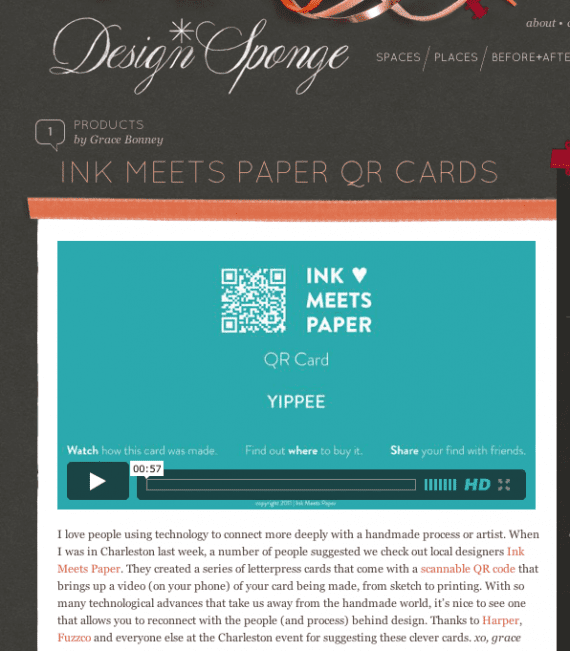
INK MEETS PAPER was featured on Design*Sponge! We’ve been following Grace’s blog since Jamie’s days at SCAD, so it’s such an honor to be featured. I particularly love this quote from the article: “With so many technological advances that take us away from the handmade world, it’s nice to see one that allows you to reconnect with the people (and process) behind design.”
The North Charleston Artist Guild and the Olde North Charleston Merchants Association hosted a fall arts festival along East Montague Avenue in Park Circle. The street was blocked off to traffic, and guild members set up tents along the street (selling everything from glasswork and ceramics to jewelry and mixed media pieces). There was live music and a kids art area as well.
This was our first big outdoor arts festival for INK MEETS PAPER, and we were not only participants but also event coordinators. While it took a lot of hard work (and late nights), we had over 20 participating artists and brought a huge crowd out to Park Circle. It was really refreshing to see such support of the arts community, and I think it really helped showcase to the public the amount of local talent.
Our booth featured lots of vintage elements (including a type tray, mason jars filled with little treasures, an old roller box).
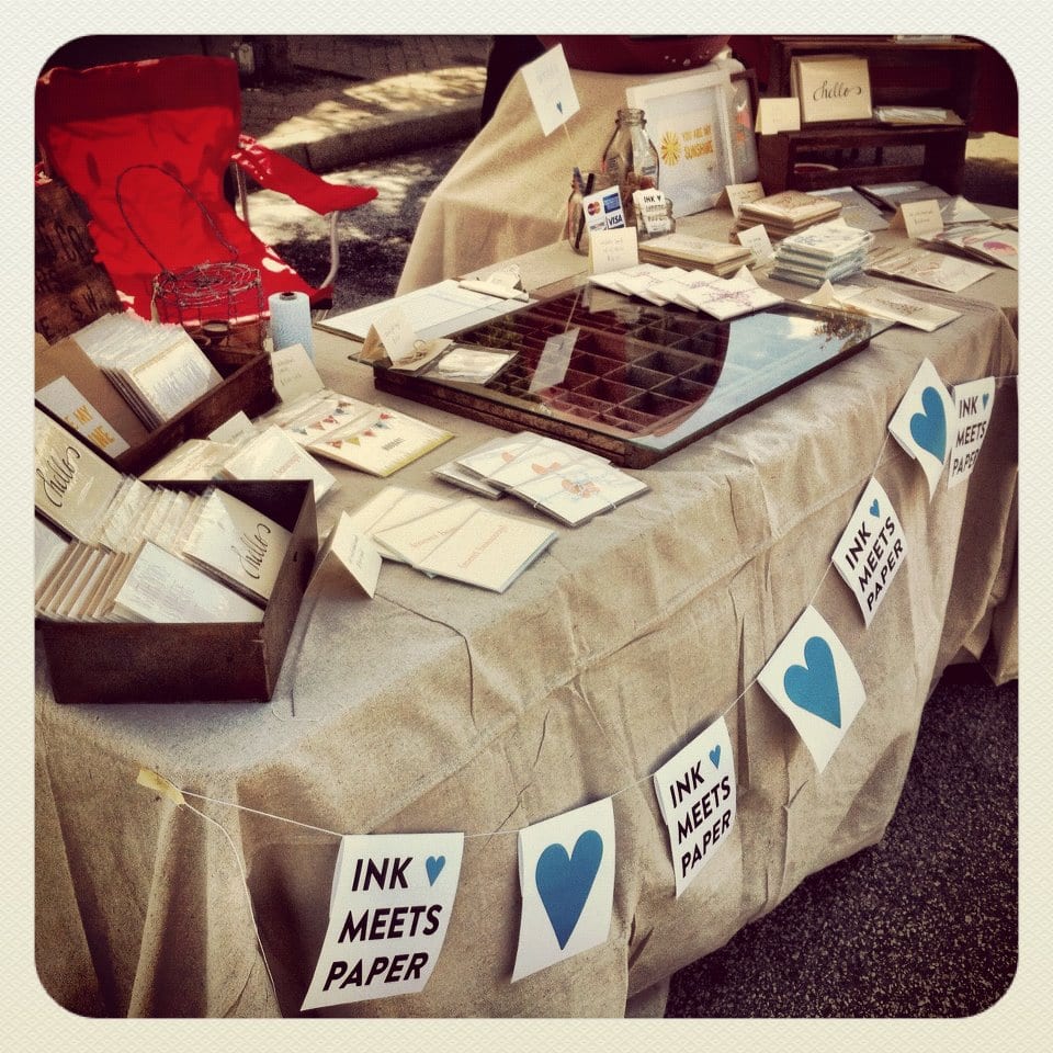
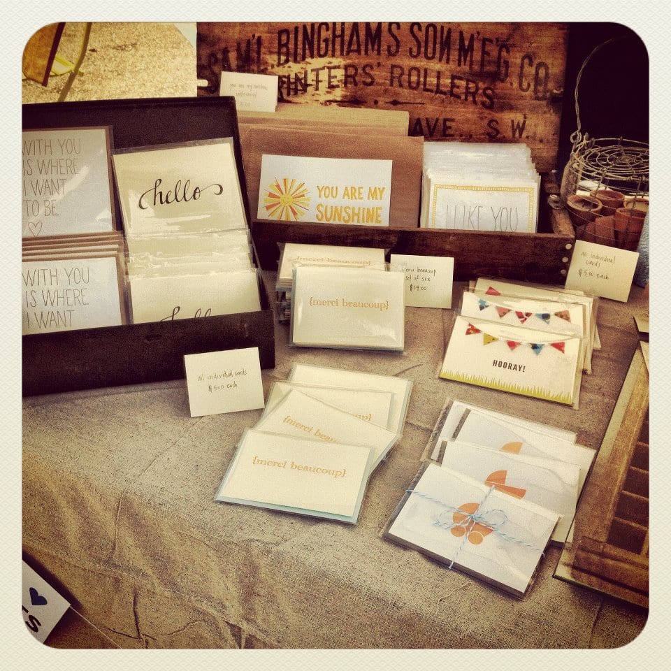
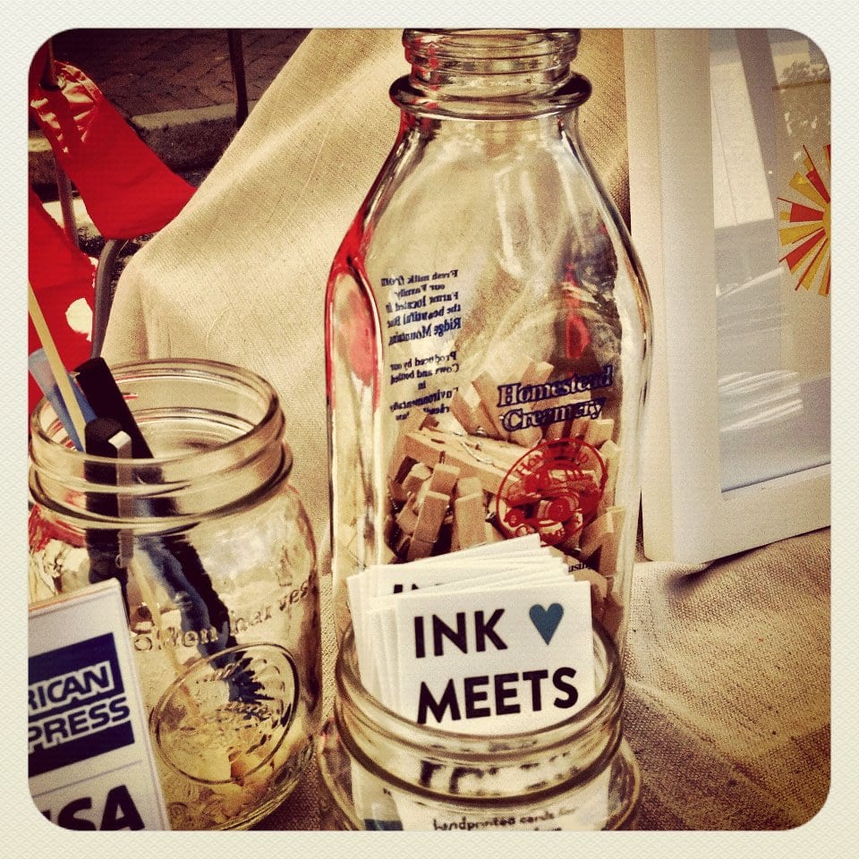
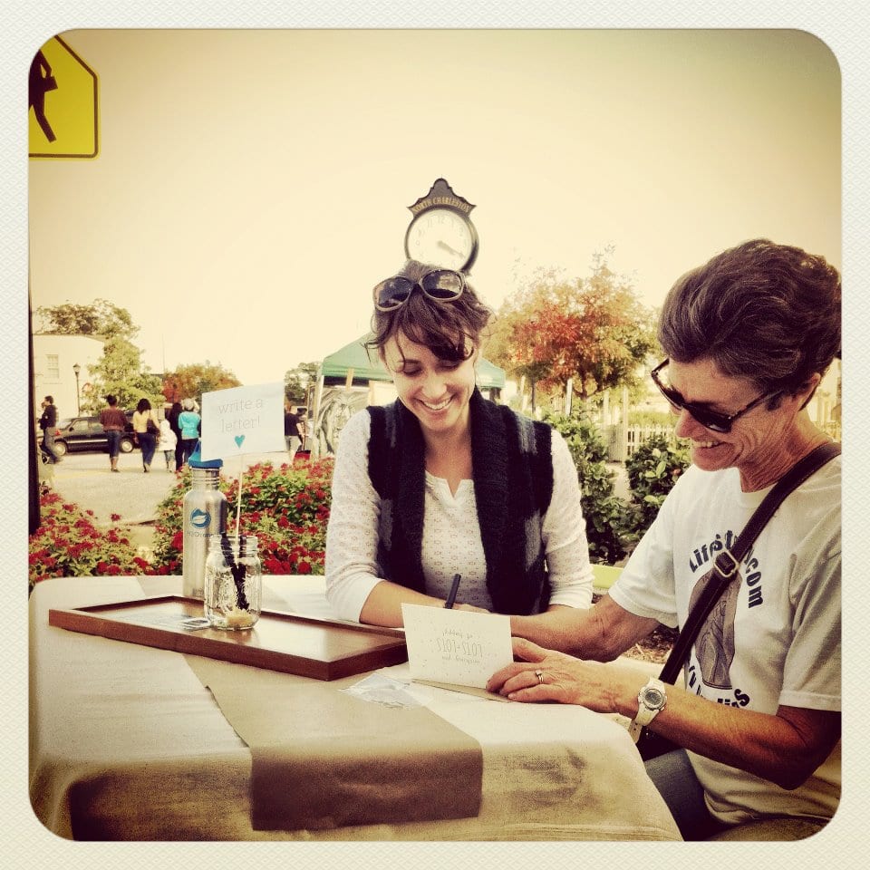
One of my favorite parts of our booth was a separate letter writing area. I loved how many people took the time to pick out a card and then sit down to write a thoughtful note. We even made mailing the letters easy: we had plenty of stamps, and there was a cute blue mailbox on the sidewalk several yards away.
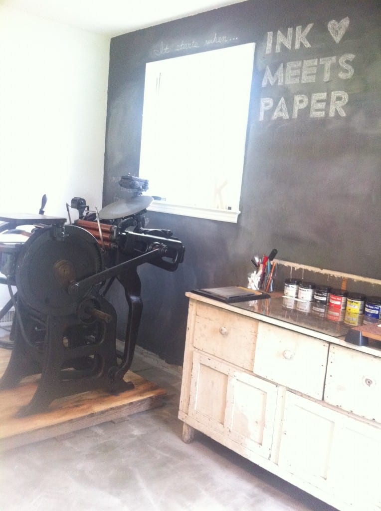
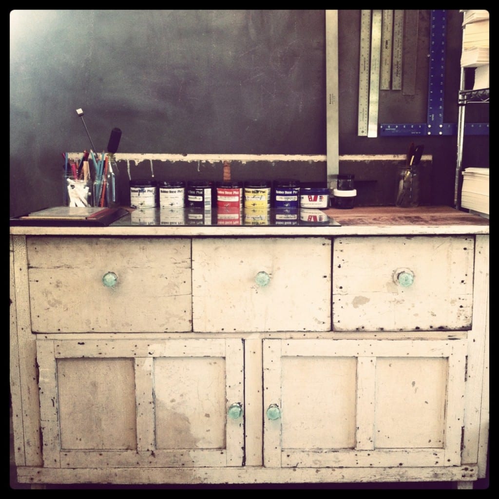
We’d been looking for additional table and storage space for the studio, so I couldn’t believe our good luck at this amazing curbside find (and it’s the perfect size for our studio space).
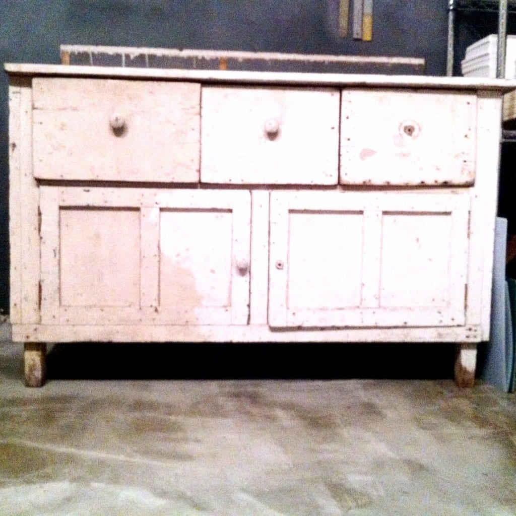
Jamie and I briefly talked about sanding and repainting the piece but ultimately decided the existing weathered finish had more character and fit our current aesthetic in the studio.
In order to make the cabinet function as an ink mixing table, we added a piece of glass to the wooden top. The top isn’t in great shape, so the glass covers the uneven parts of the wood and provides a nonporous surface for mixing inks. (I should also mention that the glass piece was another curbside find. It was a glass shelf from an old entertainment center.)
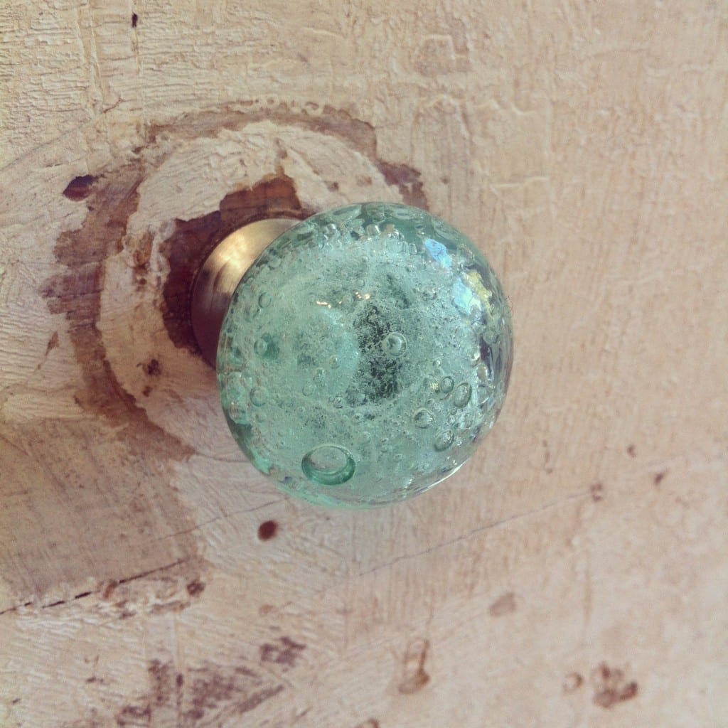
These bubbled glass knobs (in teal) from Anthropologie added a nice pop of color.
While there’s not a huge difference in the cabinet’s appearance, we were able to salvage pieces that would have been taken to the dump and instead turn them into functional studio pieces (which is completely aligned with how we were able to transform the life of our printing press as well).
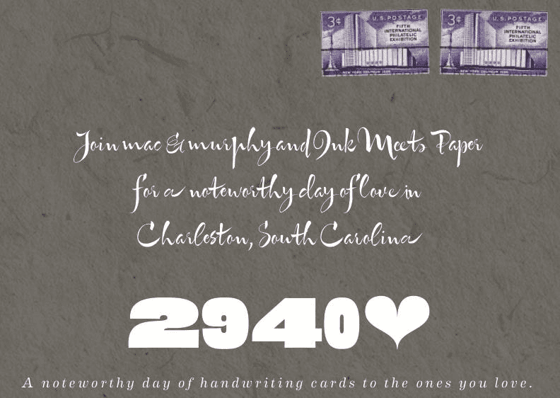
A day just for writing letters! Jamie and I had so much fun at mac & murphy for 2940heart, Charleston’s first-ever day to celebrate handwritten correspondence.
The event card was designed to look like an addressed envelope– complete with vintage stamps.
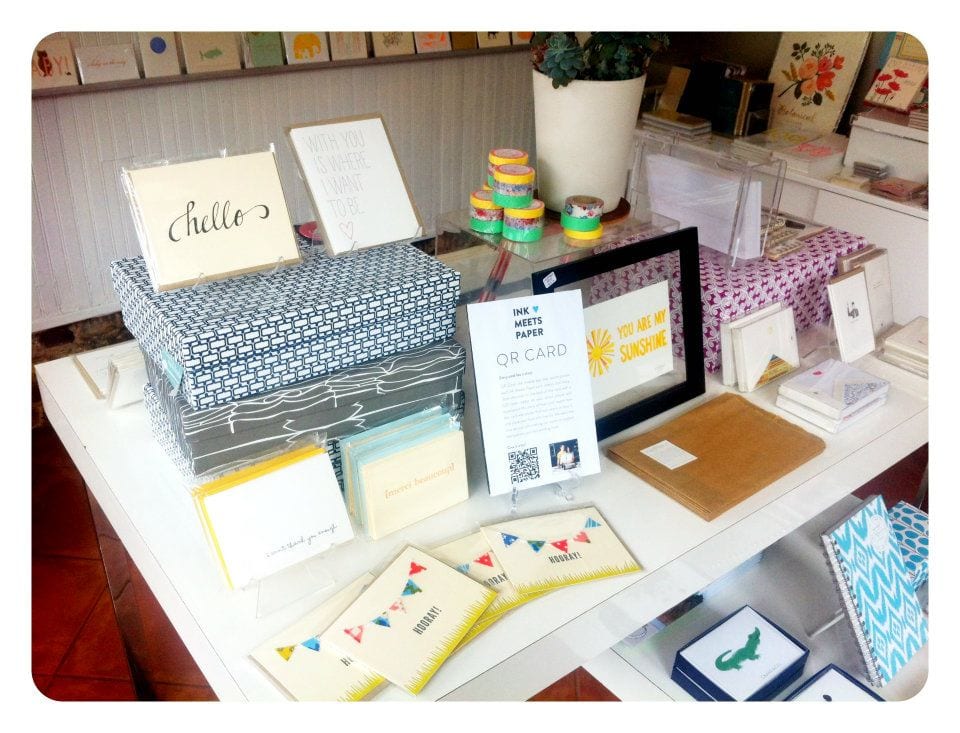
Liz and Ami set up an awesome display of INK MEETS PAPER cards, and we spent the day chatting about stationery, sharing our love of letterpress, and writing cards.
I especially loved seeing all of the little ones out writing cards.
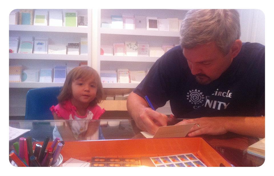
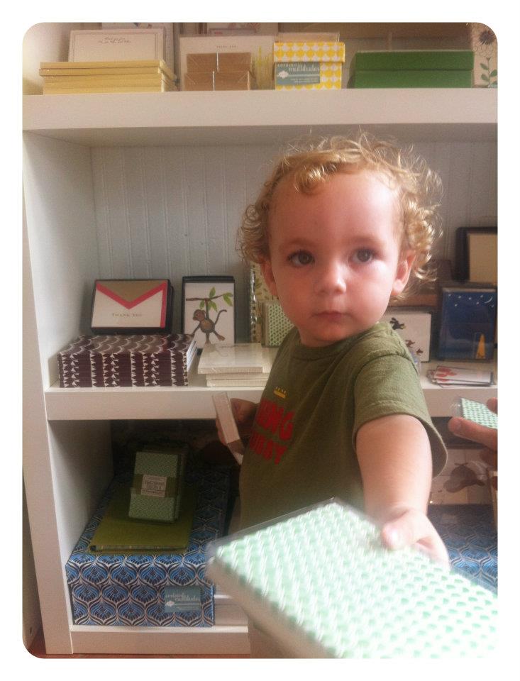
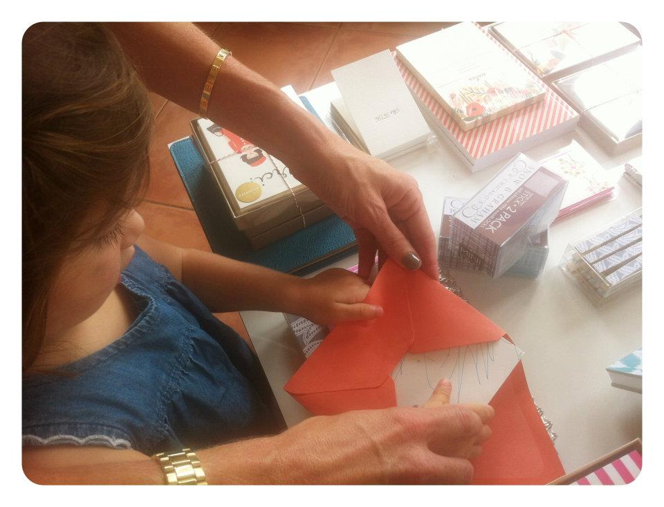
Not only did we have a fantastic time, but we’re definitely sure all of the card recipients’ days were brightened when they received handwritten cards.
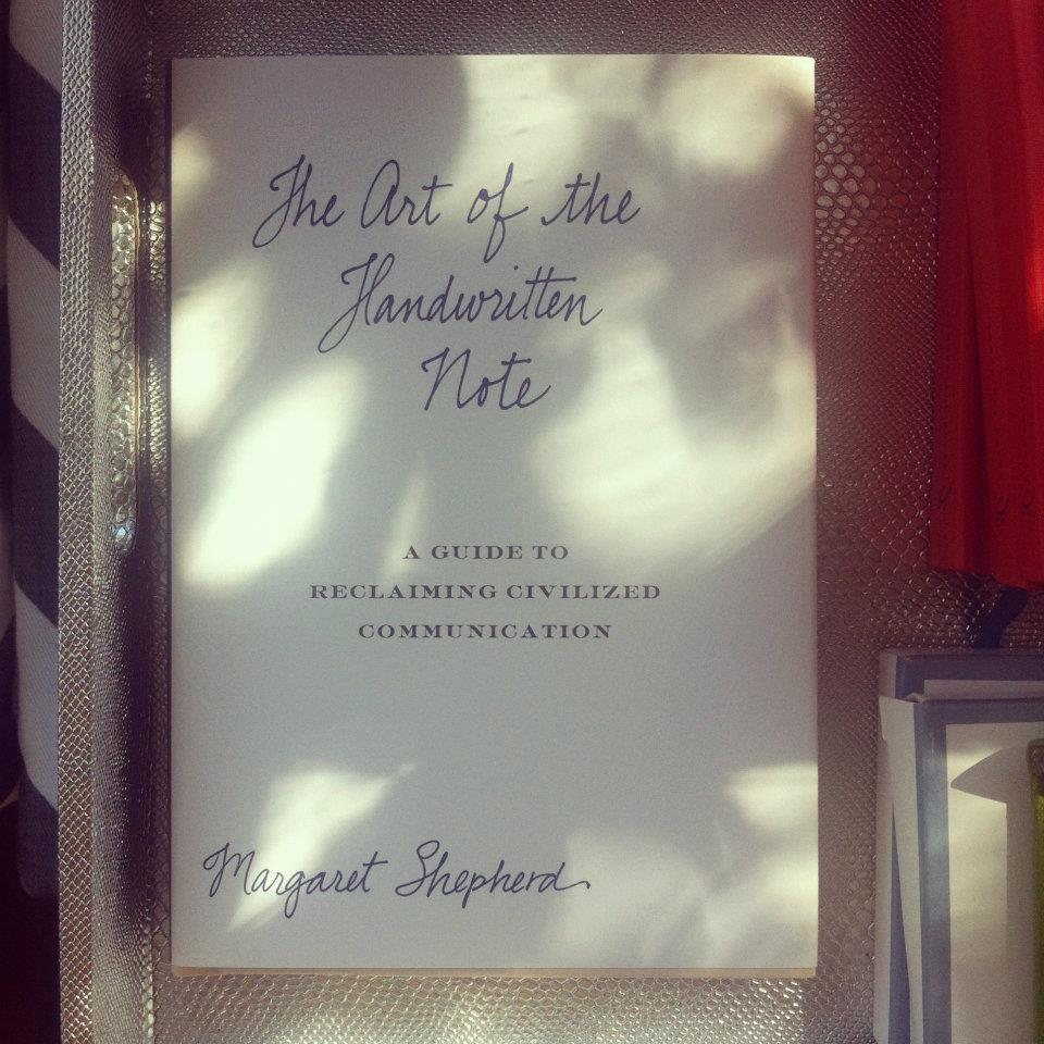
P.S. If you feel a bit nervous about sitting down and writing a letter to someone, check out Margaret Shepherd’s The Art of the Handwritten Note (also available at mac & murphy). Shepherd discusses the importance of handwritten correspondence and even includes example scenarios and responses.
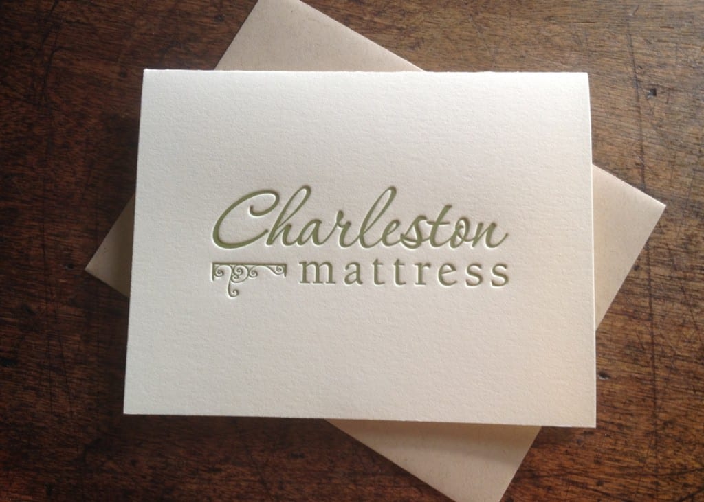
Since 1914, Charleston Mattress has been producing high-end bedding to well-known Charleston hotel guest rooms, including The Woodlands Inn, Planters Inn, French Quarter Inn, Ansonborough Inn, and more. They’ve recently opened a showroom and made their mattresses available for purchase by the public.
Charleston Mattress, located at the old Navy Yard, is nearby the INK MEETS PAPER studio, and we love that they value handwritten correspondence.
We printed their logo (in Charleston green ink) onto 110-lb, 100% cotton, ecru-colored paper. Paired with a recycled kraft envelope, these cards definitely make an impact.
